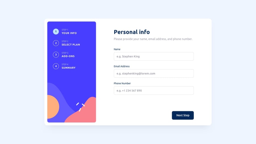
Responsive sign up form built with Typescript & React
Design comparison
Solution retrospective
Accessibility - I wanted to focus on making my form as accessible as possible and learned a lot in the process. I learned the importance of using inputs, buttons, and other vanilla html form elements as much as possible to utilize the browsers default accessibility functionality. If I have time in the future I'd like to go back in and update the font sizes in my CSS to some values calculated in :root based off of the user's REM font settings.
React Hook Form - using default html form elements in react is a little tricky sometimes. Learning to use the react-hook-form package was a little bit of a learning curve, but once you get the hang of it it can run smoothly. It's just a shame that you have to download a package to work around React's design philosophy of controlled inputs in order to use a browsers default functionality for elements like radio buttons and tab order. It made me appreciate Svelte's design approach a bit more.
What specific areas of your project would you like help with?Accessibility - I'd love to be an expert in developing accessible websites and web apps. So any pointers would be greatly appreciated.
React - Any tips on developing for React would also be appreciated. There's always more to learn there and I'm fairly new to it.
Community feedback
- @cyber-mPosted 26 days ago
Hi Christopher, Great job! In terms of accessibility, I'm not an expert but I'm pretty sure your contrast ratio on your step number text is pretty low. You can check color contrast ratio using tool like Stark as a designer I more familiar with the Figma plugin but I know they also have chrome extension to check websites.
0
Please log in to post a comment
Log in with GitHubJoin our Discord community
Join thousands of Frontend Mentor community members taking the challenges, sharing resources, helping each other, and chatting about all things front-end!
Join our Discord
