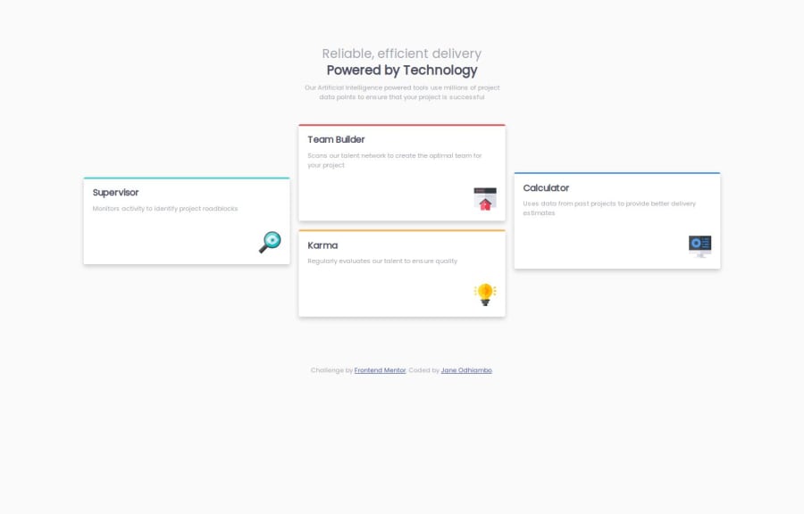


Design comparison

Community feedback
- @yamadaMk12Posted 2 months ago
It’s good practice to use semantic elements like <article> or <section> where applicable to give structure and clarity to the document.
The <footer> content is simple and well-structured but could be more descriptive for accessibility, such as using an aria-label for the footer if the content structure permits.
The images could be grouped with an alt text that clarifies their role within the layout to improve accessibility, especially if they are decorative icons.
Flexbox usage: While you've used flexbox well in many places, there are a couple of instances where max-width: 33.33% and flex: 33.33% are set on the .column. This can be simplified or optimized. The flex property can often handle both width and alignment, so you may not need max-width in most cases.
Box-sizing: Using box-sizing: border-box; globally is a great practice, but make sure this rule isn't overwritten by any conflicting styles. You've done well to apply it globally.
Font Size Consistency: The font-size for various text elements like headings and paragraphs could be more consistent. Using rem or em units for font sizing across the entire page would help with responsiveness and maintain consistency. For example, font-size: 2.2rem for h1 can feel large on smaller screens—consider making it more responsive using vw or a calc() function.
0

Please log in to post a comment
Log in with GitHub
Join our Discord community
Join thousands of Frontend Mentor community members taking the challenges, sharing resources, helping each other, and chatting about all things front-end!
Join our Discord