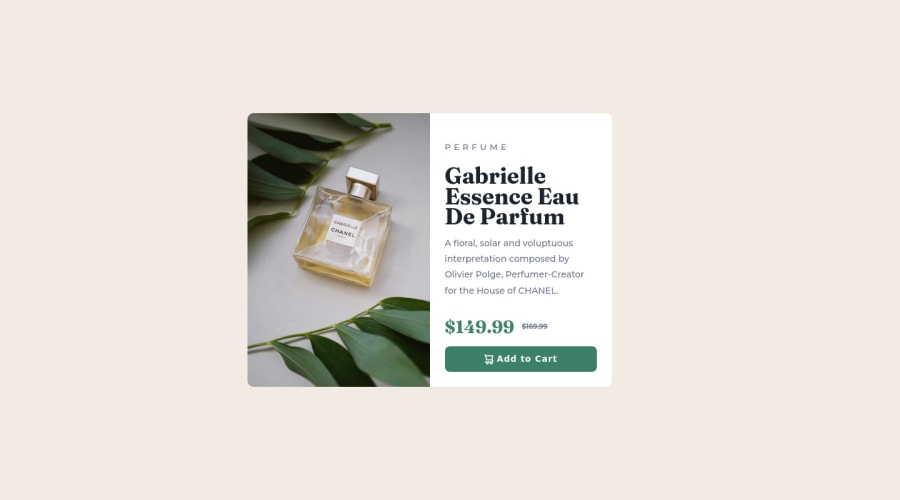
Responsive SCSS, CSS Flexbox product card
Design comparison
Solution retrospective
What do you think about my overall code quality? Is it well structured, readable and understandable?
What techniques/best practices should I use in order to improve this code's quality?
Is it a better practice to set the product image as the <div>'s background image through CSS, like I did, or just wrap the image in a <picture> HTML tag?
How can I apply the "border-radius" CSS property to the whole product card? In order to give it rounded borders, I had to apply said property to both <div>s it consists of.
Any other feedback/advice is absolutely welcome and appreciated.
Community feedback
- @MelvinAguilarPosted over 2 years ago
Hi @dedsec-ninja420 👋, good job on completing this challenge! 🎉
I have some suggestions you might consider to improve your code:
- Is it a better practice to set the product image as the <div>'s background image through CSS? : In this challenge, you should not use the background property to set the image because this image has semantic meaning. Use the CSS background property if the image is not part of the content. Instead, use the <picture> tag.
- How can I apply the "border-radius" CSS property to the whole product card? : Add border-radius and overflow hidden to the container with
class="product".
.product {
   border-radius: 10px;
   overflow: hidden;
}
And remove all the individual corners:
.product .product-img {
    /* border-radius: 10px; */
    /* border-top-right-radius: 0; */
    /* border-bottom-right-radius: 0; */
}
.product .product-info {
    /* border-radius: 10px; */
    /* border-top-left-radius: 0; */
    /* border-bottom-left-radius: 0; */
}
 /* And remove border-radius from the media query */
Here are some other suggestions:
- Use the
<main>tag to wrap all the main content in your solution instead of using<div class="product">.
- Instead of using pixels in font size, use relative units of measure like
remorem. The font size in absolute length units (px) does not allow users with limited vision to change the text size in some browsers. Reference.
- The
<h1>element is the main heading on a webpage, also, there should only be one<h1>tag per page.<h1>$149.99</h1>is not a heading element.
- Always avoid skipping heading levels; Always start from
<h1>, followed by<h2>, and so on up to <h6> (<h1>,<h2>,...,<h6>).
I hope those tips will help you! 👍
Good job, and happy coding! 😁
Marked as helpful1@dedsec-ninja420Posted over 2 years ago@MelvinAguilar these tips are absolute gold, I'll look forward to apply them. Tysm 🙌🏻
1
Please log in to post a comment
Log in with GitHubJoin our Discord community
Join thousands of Frontend Mentor community members taking the challenges, sharing resources, helping each other, and chatting about all things front-end!
Join our Discord
