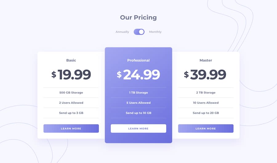
Design comparison
Solution retrospective
What do I learn from this challenge?
Practically use background including linear gradient background and place the image at the different position. 🚩 What I'd like to improve but haven't found the solutions?
A comfortable workflow to create simple challenges.
I would like to hear any suggestions from you :) happy coding.
Community feedback
- @RocTanweerPosted almost 4 years ago
Hello, You may wanna do overflow hidden on your main container because there is a horizontal scroll bar which is not suppose to be.
hope it helps!
0@greatmetisPosted almost 4 years ago@RocTanweer Thank you very much! I have fixed it, and it looks nicer. You really pay attention to the details. ;) Enjoy your weekend!
0
Please log in to post a comment
Log in with GitHubJoin our Discord community
Join thousands of Frontend Mentor community members taking the challenges, sharing resources, helping each other, and chatting about all things front-end!
Join our Discord
