Responsive Room-Homepage using [NextJS, Image Slider]
Design comparison
Solution retrospective
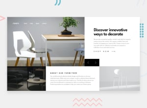
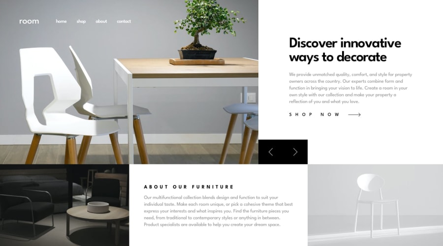
Hi everyone, this is my solution of Responsive Room-Homepage using [NextJS, CSS Grid, Flexbox]. For me, the most difficult parts are <img srcset="" sizes=""> and the sizing of image slider. I'm happy to complete this challenge.
Any comment would be appreciated. Thank you! :D
Community feedback
- @IheziePosted about 1 year ago
Hey! Great solution👍. I also tried using
<img srcset="" sizes="">in my solution to this challenge; however, that didn't work out for me. So I used this instead:<picture > <source media="(max-width: 450px)" srcset={item.images.mobile} /> <img src={item.images.desktop} alt="hero" /> </picture>This method allowed me to use different hero images for varying screen sizes. Hope this helped.😊
1@kennylun123Posted about 1 year ago@Ihezie Hi, thanks for your reply! I agree to use
<picture>element instead of <img srcset="" sizes=""> since its complexity.<img key={index} className={styles.slides} src={slide.img.src} srcSet={`${slide.img.src}, ${slide.imgMobile.src} 375w`} alt={`slide image ${index}`} />*Explanation: The image with 375w descriptor will only be used when the viewport width is lower than 375 pixels. And the image url in the srcset will not narrow down once the larger image is selected.
More details in below.
https://stackoverflow.com/questions/24132972/picture-source-element-vs-img-srcset-attribute
0
Please log in to post a comment
Log in with GitHubJoin our Discord community
Join thousands of Frontend Mentor community members taking the challenges, sharing resources, helping each other, and chatting about all things front-end!
Join our Discord
