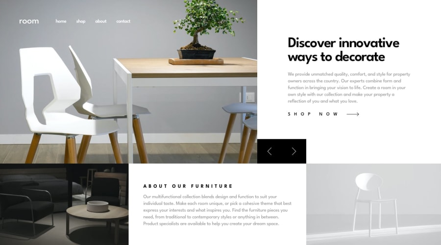
Responsive Room Homepage with React, Tailwindcss and TypeScript
Design comparison
Solution retrospective
Im really proud of my solution in general, but for the image slider (or carousel) I used a library called "flowbite" wich is an open-source library of over 600+ UI components, sections, and pages built with the utility classes from Tailwind CSS. Their documentation is awesome and it was really easy to understand it. But I would like to try to do my own carousel instead of a library.
What challenges did you encounter, and how did you overcome them?I don't have much experience with TailwindCSS; I used to write pure csscode. For this reason, I faced some problems during development. For example, the hamburger menu and mobile navigation were among them. Although I knew what I wanted to achieve, I couldn't do it properly. But, with some cups of coffee and several hours reading the documentation, I was able to create a landing page as close as possible to the expected design.
Community feedback
Please log in to post a comment
Log in with GitHubJoin our Discord community
Join thousands of Frontend Mentor community members taking the challenges, sharing resources, helping each other, and chatting about all things front-end!
Join our Discord
