
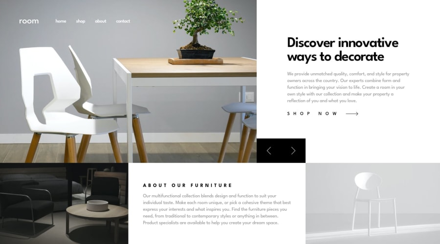
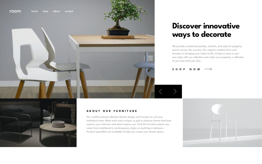
Responsive Room homepage using Desktop-first approach and css grid


Design comparison
Solution retrospective
For desktop screens, I have used vh and vw units so that content could adjust if the browser is zoomed in or out. For small screens, I used rem units. So my question is, does zooming the browser in or out simulate different screen resolutions?
Thanks in advance.
Community feedback
- @IshmaelsealeyPosted over 1 year ago
Hi Ivan!
Well done on completing the challenge! It resembles the design intimately.
To answer your question, yes it does. When using google chrome, if I increase my zoom value, eventually a website will appear in it's mobile version as the browser thinks that the screen is less pixels wide. I found this stack overflow response that also explains it.
I hope my response helps you!
Happy coding
Marked as helpful0
Please log in to post a comment
Log in with GitHub
Join our Discord community
Join thousands of Frontend Mentor community members taking the challenges, sharing resources, helping each other, and chatting about all things front-end!
Join our Discord