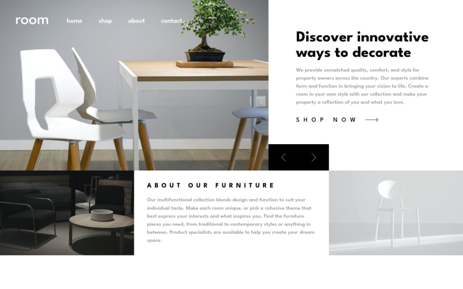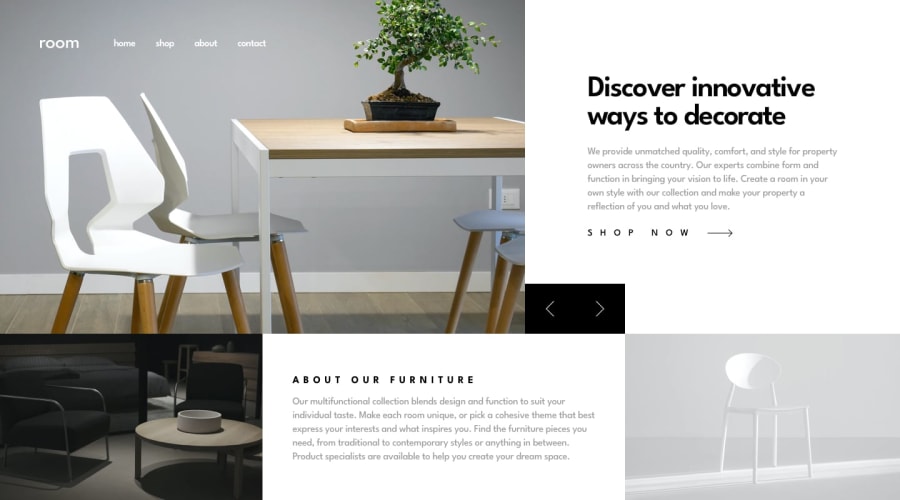
Design comparison
Solution retrospective
First time using vite. Although I only made use of it's live server function:). I tried to make the layout as responsive as possible with grid template areas, but please, suggest better practices.
Creating the slider was pretty hard, I managed to make it by adding active class to the slides on button click, and changing their display from none to grid. I wanted to do it with opacity of 0, to add some animation, but in order to do that I need to position the slides inside of their container absolute. When I do that, the height of container becomes 0, and it breaks the layout. I've been googling for quite a while but still have no idea why this is happening.
Community feedback
Please log in to post a comment
Log in with GitHubJoin our Discord community
Join thousands of Frontend Mentor community members taking the challenges, sharing resources, helping each other, and chatting about all things front-end!
Join our Discord
