Design comparison
SolutionDesign
Community feedback
- @kamiliano1Posted over 1 year ago
Hello,
Congratulations on completing this challenge.
You might consider having
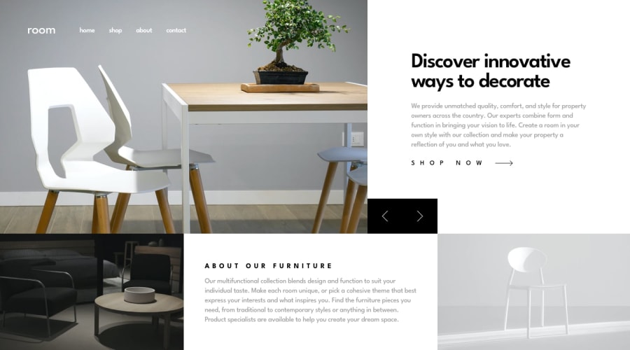
max-widthon the<main>element because, on the big screen, the page is stretched. After that to center it, you can usemargin-left: automargin-right: autoor use one propertymargin-inline: auto0
Please log in to post a comment
Log in with GitHubJoin our Discord community
Join thousands of Frontend Mentor community members taking the challenges, sharing resources, helping each other, and chatting about all things front-end!
Join our Discord
