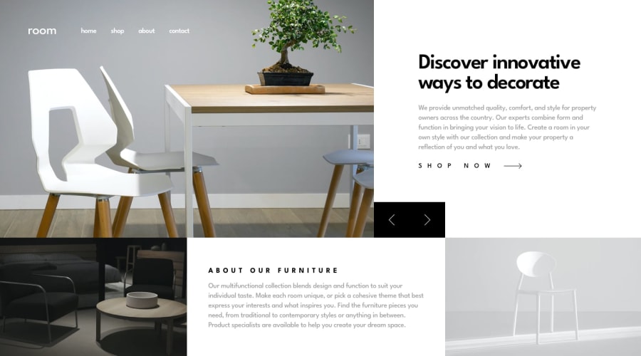
Responsive Room homepage in NextJS
Design comparison
Solution retrospective
Hi, This challenge has been the most difficult and most worked solution I have completed so far on Frontend Mentor. I had to redo a few times my responsive design implementation. I had a lot of overflow issues that I could not identify. I had to change a little the design for the header menu and the mobile dropdown drawer, which actually is a tabs menu. Overall it has been a fun project. Feedback is welcome. Thank you!
Please log in to post a comment
Log in with GitHubCommunity feedback
No feedback yet. Be the first to give feedback on Catalin-Marius Untea's solution.
Join our Discord community
Join thousands of Frontend Mentor community members taking the challenges, sharing resources, helping each other, and chatting about all things front-end!
Join our Discord
