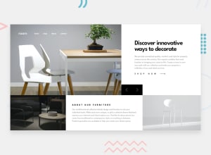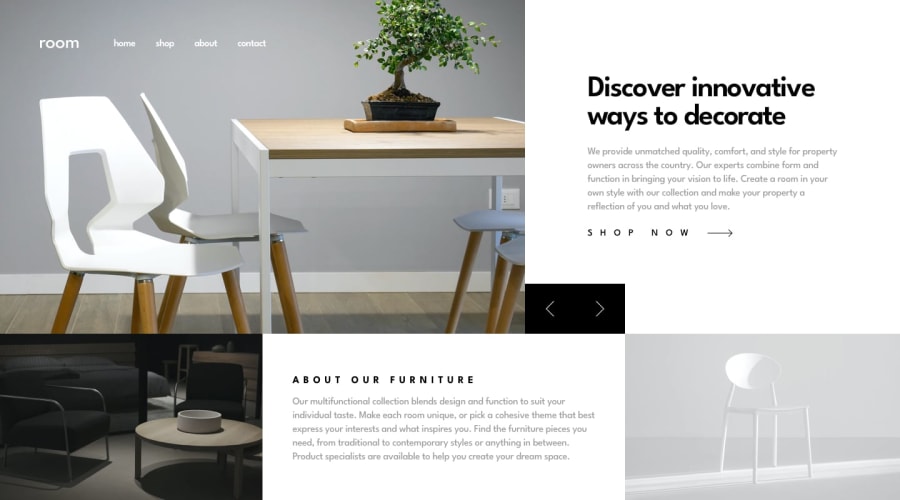
Design comparison
Solution retrospective
I'm happy with Carousel since it's my first experience with building a craousel using background image rathern than images. Also the layout is perfect both in desktop and mobile layout. I can't think of something to do different the next time except for being more experienced and not to be stuck as much as i did this time.
What challenges did you encounter, and how did you overcome them?The layout was abit challenging initially I went for flex and later decided grid is better for the main container. As for the Carousel it was difficult to make the transition smooth as I had to changed background image right after transition so my solution was to set timeout for changing the background slightly less than the timeout for transition.
What specific areas of your project would you like help with?Both in layout and Carousel.
Community feedback
- @jeangu2002Posted 4 months ago
Good job! The slider animations are kinda slow
0@Maryam1982Posted 4 months ago@jeangu2002 Thanks for your feedback. Yes I agree, maybe I was too lazy to change the timing :D
0
Please log in to post a comment
Log in with GitHubJoin our Discord community
Join thousands of Frontend Mentor community members taking the challenges, sharing resources, helping each other, and chatting about all things front-end!
Join our Discord
