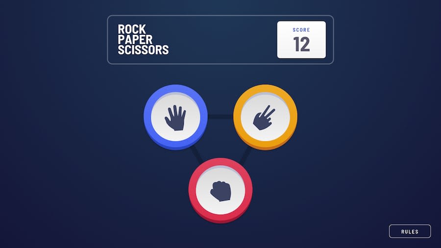
Responsive Rock-Paper-Scissors game using CSS Grid
Design comparison
Solution retrospective
Hello Fellow developers,
It's been a while since I last shared my journey here. Balancing school activities and coding can be quite a task. However, as my exams drew to a close, I felt the need to challenge myself and improve my coding skills.
Have you ever been in a situation where you couldn't decide how to manage time? How did you navigate through it?, share your experience in the comment section.
I recently took this advanced challenge that required me to work with HTML, CSS, and JavaScript. It was one of the most demanding tasks I've encountered on my tech journey.
I faced UI issues that pushed me to revisit the fundamentals of CSS, particularly the display property, to get the layout just right. A piece of advice to my future self: Always break down a UI into its basic elements before diving into coding, it'll save you a lot of time.
Here's what I gained: -Proficiency with the Object-fit CSS property.
- Mastery of the repeating-radial-gradient CSS property for captivating design effects.
Remember, growth happens when we step out of our comfort zones. Stay curious and keep coding!
Community feedback
Please log in to post a comment
Log in with GitHubJoin our Discord community
Join thousands of Frontend Mentor community members taking the challenges, sharing resources, helping each other, and chatting about all things front-end!
Join our Discord
