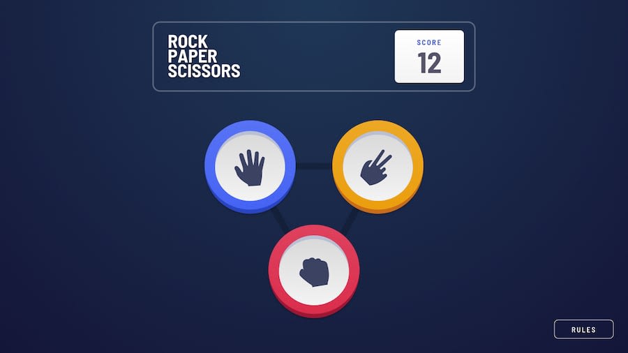
Design comparison
Solution retrospective
I made the rock paper scissors project and it was really fun. it took more than 8 hours to complete.
there was some point where I had to think a little bit. first thought I can append and make changes. but this made the project more problematic. then decided to make rps buttons by an array. and the thing worked. everyone should follow some best practices like commenting and writing clear code.
overall the project was fun and I enjoyed a lot
Community feedback
- @Illyaas4ShowPosted over 2 years ago
Hi Adnan, actually love your project and it was so much fun!
I think it would be better if you add
transition: .7s all ease;to some of your elements so that it can smoothly transition to it's hover state. Where it says 'all', you can put specific attributes like colour or width or margin etc. This will make your project a lot more smooth.Find out more about transition here.
I hope this helps! Happy coding!
Marked as helpful0
Please log in to post a comment
Log in with GitHubJoin our Discord community
Join thousands of Frontend Mentor community members taking the challenges, sharing resources, helping each other, and chatting about all things front-end!
Join our Discord
