Submitted almost 2 years ago
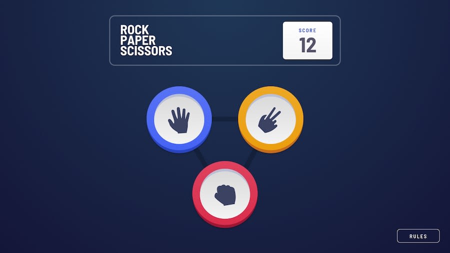
Responsive Rock Paper Scissors with Randomize house option
@staticish
Design comparison
SolutionDesign
Solution retrospective
Let me know if my javascript looks good. I worked really hard to accomplish this success.
Community feedback
- @karthik2265Posted almost 2 years ago
Hey staticish,
looks good, well done
putting the border and adding a bonus button on the Title component was a good idea.
some things to improve:
- sizing of the text and images, just making them a little bigger would make it look a lot better
- the bonus button and the play again button does not show any feedback to the user when hovered or clicked, you can add some by changing the cursor to pointer on hover and scaling the button to 0.9 when active.
- try to put less logic in the html part, this would make the code more readable ,example:
{state.userOption === null ? ( <> {state.bonus ? ( <Pentagon getId={getId} /> ) : ( <Triangle getId={getId} /> )}) : ( <GamePlay usersOption={state.userOption} houseOption={state.houseOption} results={state.results} playAgain={() => { dispatch({ type: "reset" }); }} /> )} // you could wrap this in a function call or make it a component and use it- try using scoped css with css modules
1@staticishPosted almost 2 years ago@karthik2265 wdym by less logic? I should keep the Pentagon and Triangle logic in a component called <Levels />. Something like that?
0
Please log in to post a comment
Log in with GitHubJoin our Discord community
Join thousands of Frontend Mentor community members taking the challenges, sharing resources, helping each other, and chatting about all things front-end!
Join our Discord
