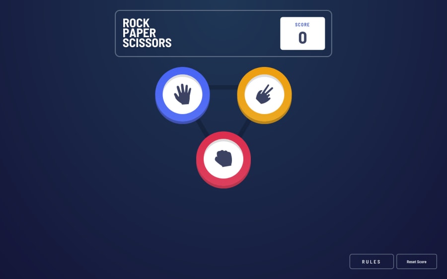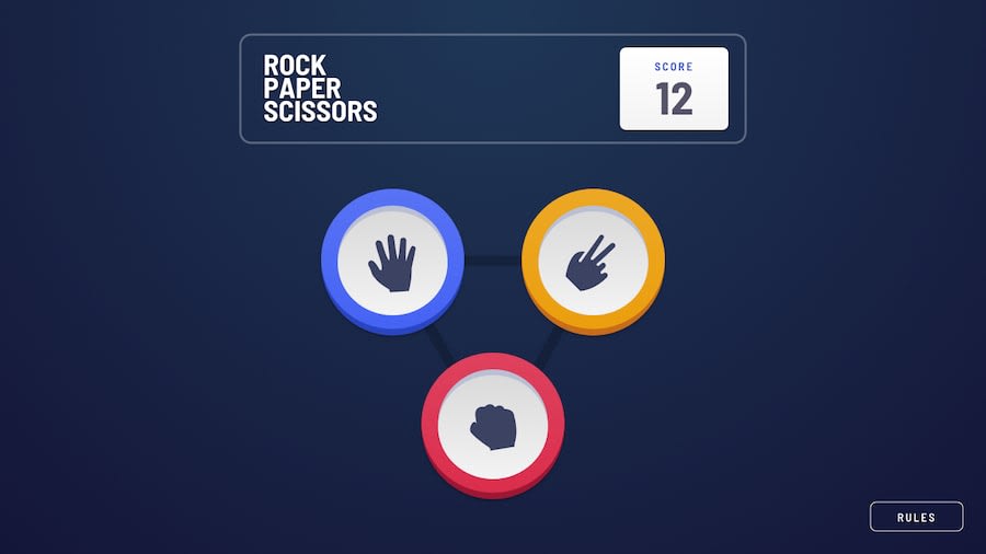
Design comparison
SolutionDesign
Solution retrospective
The only thing that I think I could do better is animation. A little animation between screens would make the game feel more fluent. But the reason is that I used the display property to switch between screens.
What do you all think about the general look and transitions? Or do you have any feedback? All contribution is welcome!
Community feedback
Please log in to post a comment
Log in with GitHubJoin our Discord community
Join thousands of Frontend Mentor community members taking the challenges, sharing resources, helping each other, and chatting about all things front-end!
Join our Discord
