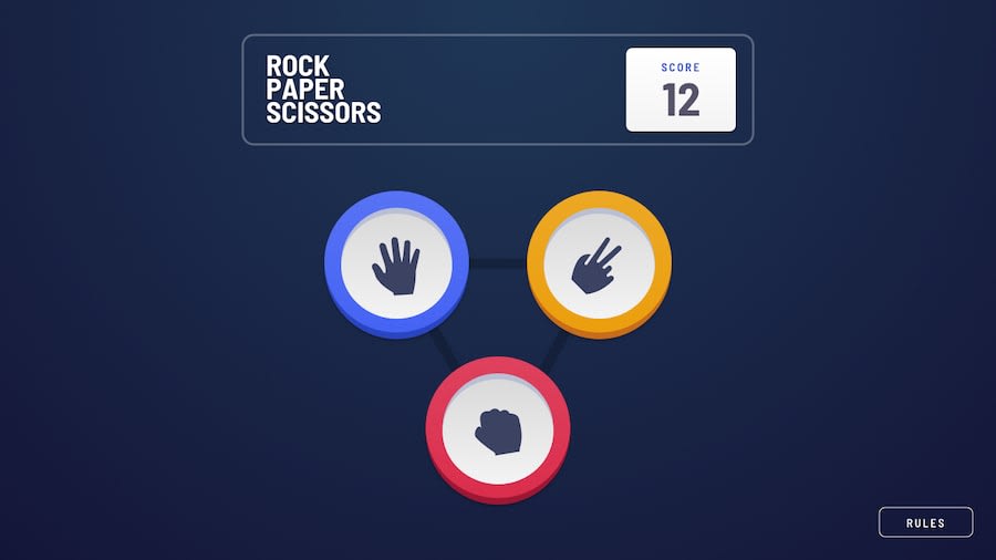
Responsive Rock Paper Scissors game with bonus stage
Design comparison
Solution retrospective
I added my own twist of animation, though it was a bit clunky. Hopefully it can be butter smooth in the future.
What challenges did you encounter, and how did you overcome them?The challenges I encoutered were mostly CSS stuff. I had to manually set positioning on each element/pick, which was an annoying but necessary process.
A bit of spaghetti here and there, but using event delegation technique really helps maintain the code cleanliness. it's not clean
What specific areas of your project would you like help with?I came with this approach personally and I really would like to know how anyone else would approach this problem.
Also, it's not a 1:1. It's a bit hard for me to eye widths and margins on these kind of stuff.
Community feedback
Please log in to post a comment
Log in with GitHubJoin our Discord community
Join thousands of Frontend Mentor community members taking the challenges, sharing resources, helping each other, and chatting about all things front-end!
Join our Discord
