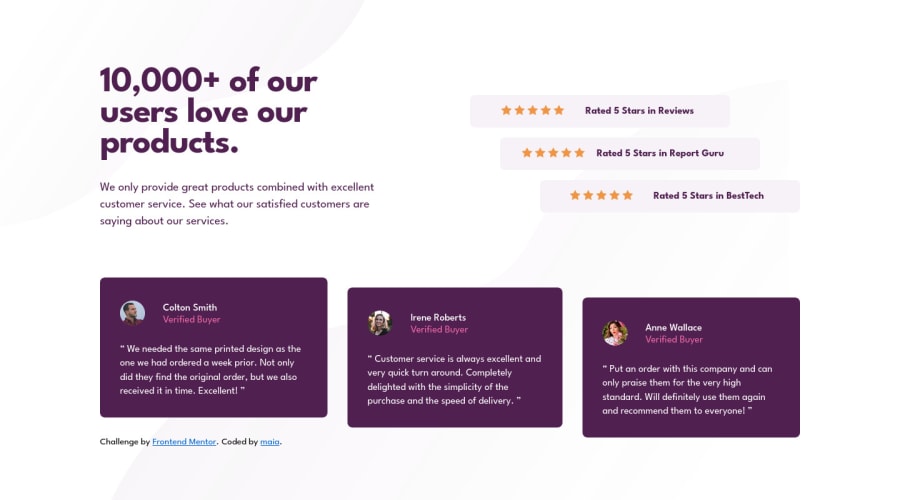
Design comparison
Solution retrospective
i don't hate the way i offset the boxes on desktop view, but i think i probably should have just done align top-center-bottom / left-center-right. i got this error on axetools: The landmark must have a unique aria-label, aria-labelledby, or title to make landmarks distinguishable about my asides (rating section) but i don't know what that means exactly. open to any suggestions for how i could have done this better :)
Community feedback
- @ericsalviPosted over 2 years ago
Hey @maiaflow, I'm not sure how I missed this one, but the overall design looks great. There is a strange overflow issue of the main text on specific screen sizes (1086px to 1200px) but other than that this one is really solid.
As for the Accessibility warning here and when using Axe DevTools, it looks like the issue is that a screen reader won't know what each of the ratings is for. Since you are using 3
asideswhat I would try doing is finding each of theh2, and giving them a uniqueid. Soid=rating1and so on.Then you can use the
aria-labelledbyon theasidesand then reference each of the different IDs so that you are telling the screen readers what each aside is meant for.Check out this article here
Hope this helps.
Marked as helpful0
Please log in to post a comment
Log in with GitHubJoin our Discord community
Join thousands of Frontend Mentor community members taking the challenges, sharing resources, helping each other, and chatting about all things front-end!
Join our Discord
