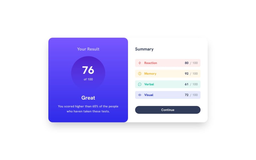
Responsive Result-Summary component with React+Typescript+TailwindCSS
Design comparison
Community feedback
- @Saad-HishamPosted over 1 year ago
Hey there, awesome job✨ on your work so far! I just wanted to offer a few friendly tips to make it even better.
Firstly, for better accessibility, it might be a good idea to wrap your card in a <main> tag instead of a <div> tag. This can help improve the structure of your page and make it easier for screen readers to navigate. Additionally, don't forget to include the "alt" attribute in your images, as this is important for accessibility.
Secondly, I noticed that the sizes of your design might not match the actual design itself. While you did a great job estimating the sizes, it might be helpful to use graphic design software like Photoshop to get accurate sizes and dimensions. Here are the correct sizes for the design:
.sm\:flex-row {
flex-direction: row;
width: 735px;
height: 530px;
}
Great work so far Keep it up🔥
1
Please log in to post a comment
Log in with GitHubJoin our Discord community
Join thousands of Frontend Mentor community members taking the challenges, sharing resources, helping each other, and chatting about all things front-end!
Join our Discord
