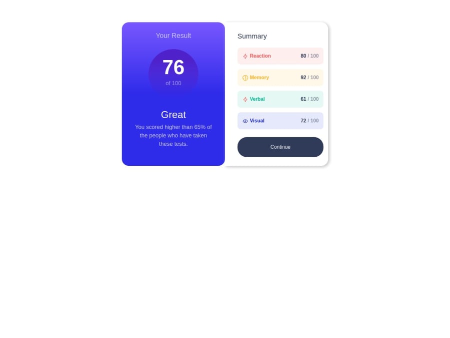
Responsive results-summary-component-main webpage on all devices
Design comparison
Solution retrospective
is it important to make the website responsive on devices under 200px width? :d I used Bootstrap only to make the web page responsive on mobile.
Community feedback
- @bccpadgePosted over 1 year ago
Hello @Y-aburob. Congratulations on completing this challenge!! 🎉
To answer your question, website should not be responsive under 200px because people don’t look at screen that size.
Here are a few tips to improve your solution.
To center your result summary component you can use Flexbox or CSS Grid
Flexbox
body{
display:flex;
justify-content:center:
align-items:center;
min-height: 100vh;

}
CSS Grid
body{
display: grid;
place-content: center;
min-height: 100vh;
}
You can add a box shadow to result summary component container.
Hope this helps you and don’t hesitate to reach out to me if you have any questions
Marked as helpful1@Y-aburobPosted over 1 year agoty for your help :).
what does the 100vh mean, and is it important to use it as a height? @bccpadge
0@bccpadgePosted over 1 year ago@Y-aburob,
No problem 😌
- 100vh takes up full viewport of the screen. (vh means viewport height)
- if you want to define a element of how tall something is you use the CSS height property.
Here is a link explaining the difference between height vs min-height.
Marked as helpful0
Please log in to post a comment
Log in with GitHubJoin our Discord community
Join thousands of Frontend Mentor community members taking the challenges, sharing resources, helping each other, and chatting about all things front-end!
Join our Discord
