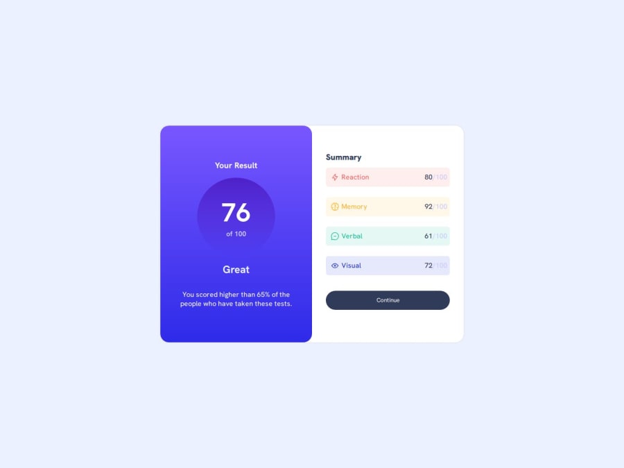
Design comparison
Community feedback
- @AdrianoEscarabotePosted about 1 month ago
Hello Mart, how are you? I was really pleased with your project, but I’d like to offer some advice that might help:
A document ought to have one primary landmark, and the absence of a main tag around the page's primary content is the root of this issue. On this page, there is no other element that is more important than the one that this challenge is based on, so to solve it, wrap all the content in the'main' tag.
It's always a good idea to pay close attention to the proper use of semantic html elements because they are crucial for screen reader users to understand what the main content of the page is in the case of the'main' tag!
Since this project is only based on a single page component, there is no need for a h1 tag. It's always a good idea to prevent accessibility errors, so I believe it would be beneficial for you to add a "h1" in this component. Don't worry if you forget about "h1," though; it's a good practice for when you are developing larger sites.
<h1>Welcome to Results summary component</h1>The rest is spot on.
Hope it’s helpful to you. 👍
Marked as helpful0@UnexplainableNo47Posted about 1 month agoThank you... this is such a comprehensive breakdown. I'll work on fixing all these errors @AdrianoEscarabote
1
Please log in to post a comment
Log in with GitHubJoin our Discord community
Join thousands of Frontend Mentor community members taking the challenges, sharing resources, helping each other, and chatting about all things front-end!
Join our Discord
