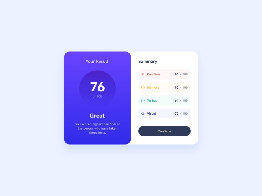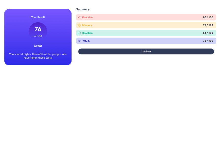
Design comparison
Solution retrospective
What are you most proud of? i didnt get it exactly how it was in the original but i still like it.
What would you do differently next time? I would try harder to get it as close to the original as possible
What challenges did you encounter, and how did you overcome them?What challenges did you encounter? How to use media queries effectively
how did you overcome them? Researching more about them
What specific areas of your project would you like help with?I would like to know how to get it centered and right next to each other in the desktop version, regarding the mobile version, i think i did a pretty good job!
Community feedback
- @TedJenklerPosted 3 months ago
Hi @CarlosFortezaa,
Nice project! Here are a few recommendations to consider:
Use of <div> Elements: It’s fine to use <div> elements when you're unsure which semantic HTML element to use. However, using semantic HTML correctly is crucial for accessibility. Incorrect use of semantic elements can negatively impact accessibility, so use <div>s judiciously.
Reduce Nesting: Your code appears to be overly nested with <div> elements. To simplify your layout, consider using display: flex with flex-direction: column to stack content vertically. This can help reduce unnecessary nesting and make your code cleaner.
Button Type: The <input type="button"> element should only be used within a form. If it's not part of a form, consider using a <button> element for better semantic meaning and functionality.
Heading Tags: Avoid overusing heading tags. Use headings for actual text headings, and for other text elements that need styling, use styled <p> or <span> tags. This approach will help keep your document structure semantic and improve readability.
Continue the great work!
Best, Teodor
Marked as helpful1@CarlosFortezaaPosted 3 months agoHey! @TedJenkler Thanks for the recommendations, be sure that i will keep those in mind when working on a different project. Appreciate you for commenting on my post and helping me! :)
1 - @SvitlanaSuslenkovaPosted 3 months ago
in your html file you need to add some container for your project (just inside of the body) it usually calls <main>, but you do already have main... so at least add some div. Without the container you can not center your project properly for desktop, after that you can also add max-width for your container.
Marked as helpful1@CarlosFortezaaPosted 3 months ago@SvitlanaSuslenkova Thank you for the reply! So basically something like this?:
<body> <div class="container"> <main> <\main> <\div> <\body>0@SvitlanaSuslenkovaPosted 3 months ago@CarlosFortezaa The best way is <body><main>your sections, articles divs, p...</main></body>.
Marked as helpful1@CarlosFortezaaPosted 3 months ago@SvitlanaSuslenkova Ok, thanks for the help! :)
0
Please log in to post a comment
Log in with GitHubJoin our Discord community
Join thousands of Frontend Mentor community members taking the challenges, sharing resources, helping each other, and chatting about all things front-end!
Join our Discord