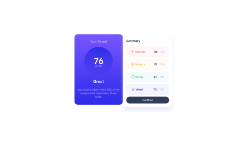
Design comparison
Solution retrospective
any ideas to make this code look better ?
Community feedback
- @Finney06Posted over 1 year ago
Hello there ๐. Good job on completing the challenge !
Here are some suggestions regarding your code that may be of interest to you.
HTML ๐ค:
To clear the Accessibility report:
-
Wrap the page's whole main content in the
<main>
tag. -
Use HTML5 semantic elements such as
<header>
,<nav>
,<main>
,<aside>
, and<footer>
to define these sections. -
Use ARIA landmarks such as
<header role="banner">
and<footer role="contentinfo">
to provide additional information about the purpose of each section to assistive technologies.
Here is a web accessibility evaluation tool๐ to check your webpage for any remaining errors or warnings related to landmarks.
I hope you find it helpful!๐ Above all, the solution you submitted is ๐. ๐Happy coding!
Marked as helpful0 -
- @maykol-vallejosPosted over 1 year ago
Hi, how are you? Look, I have two suggestions to make, the first one is that you try not to use "px" since it is a relative unit, which many times in different browsers do not respond due to accessibility issues.
For this I suggest you to use the 62.5% font size trick, you can review the following link for a better understanding and study:
https://www.aleksandrhovhannisyan.com/blog/62-5-percent-font-size-trick/
And the second suggestion is that before coding in your stylesheet you write the following code to standardize your own styles and control the proper resizing, so you will not have problems in any browser you try, since each one has its own style:
*{ margin:0 padding:0 box-sizing: border-box; }
Hope am helpful.
Well done for completing this challenge. HAPPY CODING!!
Marked as helpful0
Please log in to post a comment
Log in with GitHubJoin our Discord community
Join thousands of Frontend Mentor community members taking the challenges, sharing resources, helping each other, and chatting about all things front-end!
Join our Discord