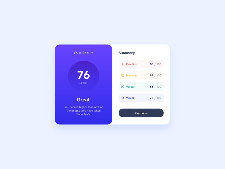
Responsive Results summary Page using Bootstrap
Design comparison
Solution retrospective
I had a hard time building the correct grid layout. All beginnings are difficult...
My Questions:
- Is bootstrap in this case an overkill / would CSS grid be sufficient?
- How to get rid of the weird gap in between the two cards in the mobile design?
- Any way to refactor the code to make it leaner?
Community feedback
- @francescomerighi1202Posted about 2 years ago
Hi there!
Your solution is good!
I have just two-three tricks to show you:
In your solution, the card appears to be separated into two "blocks", when it really should be attached.
Your media query doesn't seem to be working :( try to double check it's working and change it so that the design is the same as the requested result on mobile.
Great idea to set 'min-height', but when using flexbox to perfectly center things make sure you also use the 'justify-content: center' property in addition to that 'align-items: center'
Otherwise you can use grid, still setting a 'min-height' but using only one property to center which is 'place-content: center'
Hope I was helpful :)
In any case do not hesitate to look at my solution if you need it
Marked as helpful0@JakobTimmermannPosted about 2 years agoThanks for the really quick response :) @francescomerighi1202
As a complete newbie I have to revise this media query topic once more. I will definitely go over different other solutions. I guess that's the way to go.
0 - @0xabdulkhaliqPosted about 2 years ago
Hello there 👋. Congratulations on successfully completing the challenge! 🎉
- I have other recommendations regarding your code that I believe will be of great interest to you.
HTML 🏷️:
- This solution may cause accessibility errors due to lack of semantic markup, which causes lacking of landmark for a webpage and allows accessibility issues to screen readers, due to accessibility errors our website may not reach its intended audience, face legal consequences, and have poor search engine rankings, highlighting the importance of ensuring accessibility and avoiding errors.
- What is meant by landmark ?, They used to define major sections of your page instead of relying on generic elements like
<div>or<span>. They are use to provide a more precise detail of the structure of our webpage to the browser or screen readers
- For example:
- The
<main>element should include all content directly related to the page's main idea, so there should only be one per page - The
<footer>typically contains information about the author of the section, copyright data or links to related documents.
- The
- So resolve the issue by replacing the component wrapper
<div>element with the proper semantic element<main>in yourindex.htmlfile to improve accessibility and organization of your page
.
I hope you find this helpful 😄 Above all, the solution you submitted is great !
Happy coding!
0
Please log in to post a comment
Log in with GitHubJoin our Discord community
Join thousands of Frontend Mentor community members taking the challenges, sharing resources, helping each other, and chatting about all things front-end!
Join our Discord
