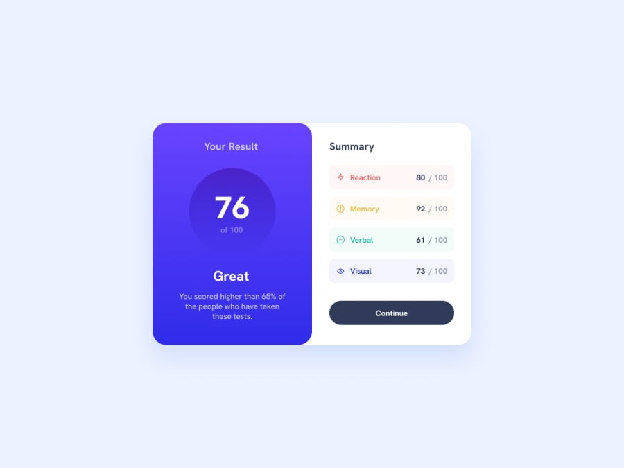
Responsive Results Summary Components using SCSS
Design comparison
Solution retrospective
Q: What did you find difficult while building the project? A: Figuring out how to use media queries with SCSS. I couldn't figure out the best way so I went with the basic one.
Q: Do you have any questions about best practices? A: Yep, what's the best way of writing media queries with SCSS that also follows a mobile-first approach? I was hoping to follow this approach that I found online: https://medium.com/@hallodom/the-solution-to-media-queries-in-sass-5493ebe16844 but wasn't able to do it so just went with the basic one.
Community feedback
- @AGutierrezRPosted over 1 year ago
Hello there 👋. Good job on completing the challenge!
I have some suggestions about your code that might interest you. For the Accessibility part:
- In order to fix the landmark warning, wrap everything in a
<main>tag, for now. - Instead of using a
<div>for thecategories-testedand it items, use a<ul>and a<li>, remove the list base styles of course.
For the Sass (SCSS) part:
- Avoid trying to fit every screen size in existence, use a limited system that allows you not to lose time in that task, in order to create this system, create variables with the target screen sizes, for example:
$sm: 0;
$md: 550px;
$lg: 768px;
$xl: 1024px;
$xxl: 1200px;
$xxxl: 1400px;
You could limit yourself to the two screen sizes that the Styleguide says. To use this you could create mixins that write the code for you:
$setting-max-width: $xxxl;

/**
 * Sets screen media query with min-width set to $min parameter.
 * @param $min {Number} [0]
 * @content Extends mixin with properties for media query.
 */
@mixin helper-breakpoint-media-min($min: 0) {
    @media only screen and (min-width: $min) {
        @content;
    }
}

/**
 * Sets screen media query with breakpoints range passed as parameters.
 * @param {Number} $min [0]
 * @param {Number} $max [$setting-max-width]
 * @content Extends mixin with properties for media query.
 */
@mixin helper-breakpoint-media-between($min: 0, $max: $setting-max-width) {
    @media only screen and (min-width: $min) and (max-width: $max) {
        @content;
    }
}

/**
 * Sets screen media query with max-width set to $max parameter.
 * @param {Number} $max [$setting-max-width]
 * @content Extends mixin with properties for media query.
 */
@mixin helper-breakpoint-media-max($max: $setting-max-width) {
    @media only screen and (max-width: $max) {
        @content;
    }
}
In this case, the
media-maxandmedia-betweenuse a$setting-max-widthvariable that is set with the$xxxlvalue.So, instead of:
body {
    width: 100vw;
    height: max-content;
    overscroll-behavior: none;

    @media screen and (min-width: 1024px) {
        height: 90vh;
        @include verticallyCenter;
    }
}
Use:
body {
    width: 100vw;
    height: max-content;
    overscroll-behavior: none;

    @include helper-breakpoint-media-min($xl) {
        height: 90vh;
        @include verticallyCenter;
    }
}
Marked as helpful1P@itsmesrishtiPosted over 1 year ago@AGutierrezR Thank you so much for your suggestions!!! I'll try implementing them next time.
If I use only certain sizes for the media queries that means that if, for example, an element's layout is breaking at 850px and I am using min-width then I should do the change at 768px (considering the aforementioned values)?
0@AGutierrezRPosted over 1 year agoHello, @itsmesrishti!!
That could be a good approach, but, it is not a silver bullet. You could avoid micro-breaks limiting the container (or the element) growth, this could be achieved with a
max-width.For example, in this project, starting from 320px screen size, you let the component width expand with the screen, and at 600px you set a new width of 70%, in this case, you could avoid this media query, and set a
max-width: 420pxand amargin: 0 autofrom the beginning, this will prevent the element from expanding and getting wear looking.Then, you could set your normal media query of
1024pxwith themax-width: 50remyou set. You could remove thewidth: 64vwand thewidth: 52vwthat you set at 1440px,If you have more questions, please ask them! I'm happy you help you in this journey!
0 - In order to fix the landmark warning, wrap everything in a
Please log in to post a comment
Log in with GitHubJoin our Discord community
Join thousands of Frontend Mentor community members taking the challenges, sharing resources, helping each other, and chatting about all things front-end!
Join our Discord
