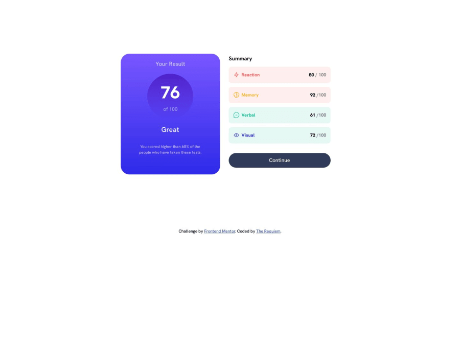
Design comparison
Solution retrospective
I wanted to practice my CSS after a break and though it was easier to complete this challenge compared to my previous ones. There are certain things I would like to get advices on best practices from more experienced programmers such as how I usually approach design from mobile first approach and usually start with a fixed mobile viewport and fixed height. I use max-width css property for smaller mobile viewports and usually set up a @media query for desktop design where I mostly fiddle with width property and sometimes even height. Is there a better, more optimized practice to keep things responsive without manually setting width and height? Another thing that I most commonly do to center the component on viewport is to set the horizontal margin as auto and fiddle with vertical margin in rem value until it looks center enough to me along with the footer. Which brings me to another of my common practice, I usually almost use rem, not pixels, not em. Any better practices there I should improve upon?
P.S I also completed the bonus challenge that requires you to use Javascript and Json file to import data instead of hardcoding it.
Thanks for taking the time to read
Community feedback
Please log in to post a comment
Log in with GitHubJoin our Discord community
Join thousands of Frontend Mentor community members taking the challenges, sharing resources, helping each other, and chatting about all things front-end!
Join our Discord
