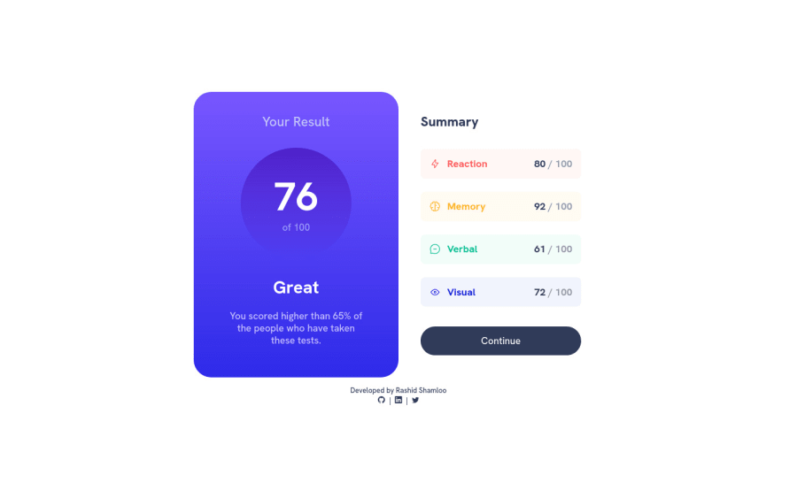
Responsive Results summary component using HTML5 + Sass + Vanilla JS


Design comparison

Solution retrospective
I used the "data.json" file to add the results and calculate the total score.
Any feedback is appreciated :)
Community feedback
- @grace-snowPosted almost 2 years ago
I think you need to work more on your html. Try turning all styles off and see what happens. That will show you where some of the gaps are.
Like you can’t have a number as the h1, that makes no sense. Would great be a heading for some content? Really try to think through the meaning of the content and how it translates to the most appropriate html elements. It’s an important skill to master
Another small thing is remove the JavaScript void from the continue button. That href can be “/“ for this. In a real project it would navigate somewhere.
Looks lovely in my mobile browser though and a nice cleanly coded solution, so well done!
Marked as helpful2@grace-snowPosted almost 2 years agoOh I just spotted one big problem
media only screen and (min-width: 481px) and (max-width: 740px) {
  html {
    font-size: 2.1vw;
  }
}
It’s super important to never use viewport units for font-size. This will remove autonomy from users. They (we) always need to be able to change font size
Marked as helpful1@rashidshamlooPosted almost 2 years ago@grace-snow Thanks for your feedback.
I have removed the "h" tags from the score number and "Great", and added an "h" tag to "Your Result" instead. so the headings now are:
- Your Result
- Summary
I have also changed the "javascript:void(0);" to "/" for the "a" tag and removed the mentioned media query as you suggested.
I have a few questions though:
-
About the media query, I have used a similar workaround in all my solutions for when the viewport width is smaller than the width of the component/design but still bigger than the mobile width to shrink and fit it in the view. Is there a similar workaround without using the viewport units? or should i just remove those media queries and let the design overflow the viewport and scrollbars to appear?
-
My other question is about using class names. I'm trying to refrain from adding too many class names to elements and instead targeting them with CSS selectors like "first-child", "first-of-type" etc. Is this a good practice or should I just use more class names instead?
0@grace-snowPosted almost 2 years ago@rashidshamloo it is GOOD to add classes to target styling. Almost always that will be better than nth child and other class-free selectors. You want low specificity and you really really want code clarity. Someone should be able to look at the html and know exactly what css selector would be controlling it.
And scroll is a GOOD thing. It is a terrible thing to make a site you've worked hard on totally inaccessible and unreadable for people.
Marked as helpful1

Please log in to post a comment
Log in with GitHub
Join our Discord community
Join thousands of Frontend Mentor community members taking the challenges, sharing resources, helping each other, and chatting about all things front-end!
Join our Discord