Submitted over 1 year ago
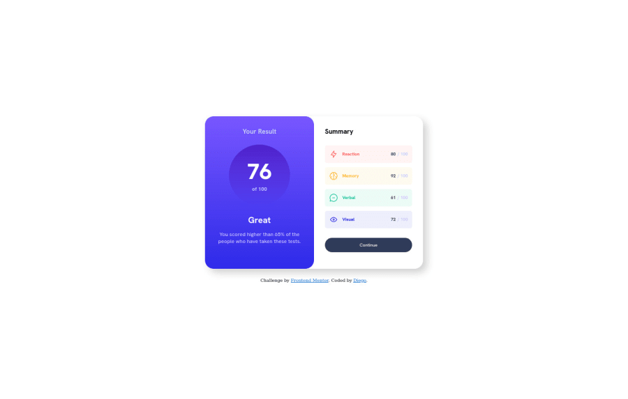
Responsive results summary component using html y css
@diegodolu
Design comparison
SolutionDesign
Solution retrospective
I found difficult something about the children of the main container. I would like to know if there is another way to allow them to occupy the same space.
Community feedback
- @Finney06Posted over 1 year ago
Hello there 👋. Good job on completing the challenge !
Here is a suggestion regarding your code that may be of interest to you.
HTML 🏷️:
To clear the Accessibility report:
- Always avoid skipping heading levels; Starting with
<h1>and working your way down the heading levels (<h2>,<h3>, etc.) helps ensure that your document has a clear and consistent hierarchy.
I hope you find it helpful!😏 Above all, the solution you submitted is 👌. 🎉Happy coding!
Marked as helpful0 - Always avoid skipping heading levels; Starting with
Please log in to post a comment
Log in with GitHubJoin our Discord community
Join thousands of Frontend Mentor community members taking the challenges, sharing resources, helping each other, and chatting about all things front-end!
Join our Discord
