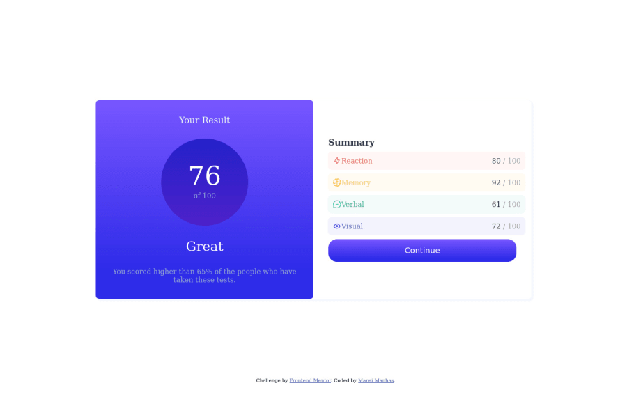
Responsive Results Summary Component using HTML + CSS Grid and flexbox
Design comparison
Community feedback
- @F4YYPosted over 1 year ago
Hi @mansi-manhas,
Congratulations on successfully completing the challenge. You did very well.
There is a recommendation to make it look more like the preview display, by applying the font-family according to the style-guide. You can click on the font-family link in it then download. Then add a link element in HTML, or import and set the font-family in CSS. Like the following code snippet:
in HTML:
   <link rel="preconnect" href="https://fonts.googleapis.com">
   <link rel="preconnect" href="https://fonts.gstatic.com" crossorigin>
   <link
href="https://fonts.googleapis.com/css2family=Hanken+Grotesk:wght@500;700;800&display=swap" rel="stylesheet">
or
in CSS:
   @import url('https://fonts.googleapis.com/css2
      family=Hanken+Grotesk:wght@500;700;800&display=swap');
Make sure to place the @import at the very top of your CSS, before any rules. And also set this:
body {
    font-family: 'Hanken Grotesk', sans-serif;
}
Hope that could be Helpful. Keep happy coding..
Marked as helpful1 - @ahsan1280khanPosted over 1 year ago
Instead of using IDs, use classes, and never use the same ID name more than once.
1
Please log in to post a comment
Log in with GitHubJoin our Discord community
Join thousands of Frontend Mentor community members taking the challenges, sharing resources, helping each other, and chatting about all things front-end!
Join our Discord
