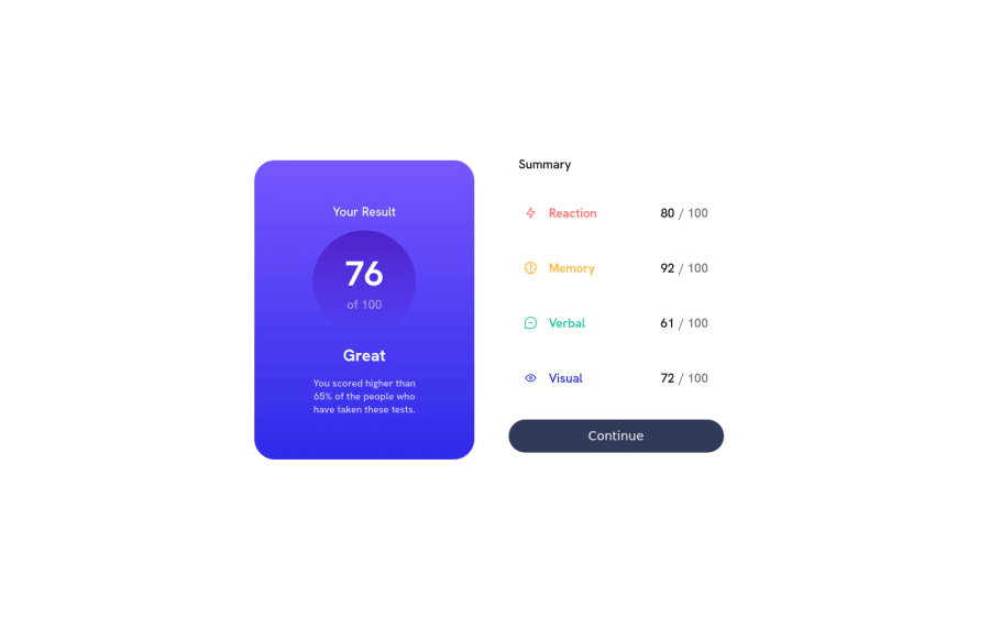
Design comparison
SolutionDesign
Solution retrospective
This was my first "bigger" project that i´ve worked on. Please give me an honest review of the code if possible, where i have to work or improve on.
That max-width / min-width in the main selector has thrown me off, espacilly in the end when i was working on the desktop-page. Can you please tell me a bit more about it?
Why can't I center my component on the crossaxis but had to do it with margin: 0 auto?
So far i´ve learnd a alot from this challenge using Flexbox.
Thank you for your time ;)
Community feedback
Please log in to post a comment
Log in with GitHubJoin our Discord community
Join thousands of Frontend Mentor community members taking the challenges, sharing resources, helping each other, and chatting about all things front-end!
Join our Discord
