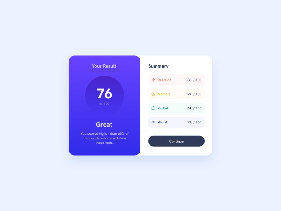
Design comparison
Solution retrospective
I am most proud of the result and summary sections. Next time, I would try to write less lines of css code.
What challenges did you encounter, and how did you overcome them?I had a bit of difficulty getting the background color of the result section until I realized that it was provided in the style guide.
What specific areas of your project would you like help with?Efficiency when it comes to code.
Community feedback
- P@danielmrz-devPosted 9 months ago
Hello there!
Congrats on completing the challenge! ✅
Your project is looking fantastic!
I'd like to suggest a way to make it even better:
- Using
marginand/orpaddingisn't always the most effective method for centering an element.
Here's a highly efficient approach to position an element at the center of the page both vertically and horizontally:
📌 Apply this CSS to the body (avoid using
positionormarginsin order to work correctly):body { min-height: 100vh; display: flex; justify-content: center; align-items: center; }I hope you find this helpful!
Keep up the excellent work!
0 - Using
- @ShoaibShujaPosted 9 months ago
Amazing job my friend a here is a quick tip for you to perfectly center your
.cardinside the body element. First remove themargin-topproperty from your.cardthen add the following lines of code to your CSS file:body { width: 100%; min-width: 100vh; display: flex; flex-direction: column; justify-content: center; align-items: center; }Everything else looks super clean and perfect. Good luck.
0
Please log in to post a comment
Log in with GitHubJoin our Discord community
Join thousands of Frontend Mentor community members taking the challenges, sharing resources, helping each other, and chatting about all things front-end!
Join our Discord
