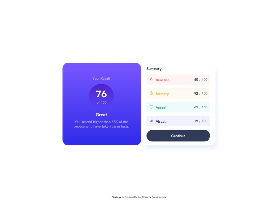
Design comparison
SolutionDesign
Solution retrospective
What are you most proud of, and what would you do differently next time?
I am most proud of being able to figure out where issues are occurring with more confidence. Responsive layouts are not my forte, however, I was able to work it out with this project by setting a flex basis to allow my content to grow the same size in bigger screens.
What challenges did you encounter, and how did you overcome them?The hardest part was figuring out what semantic html tags would be appropriate to use since a majority of the design required me to set span and div tags to style in css.
What specific areas of your project would you like help with?Cleaner ideas to set fonts and colors? Code that is dryer?
Community feedback
Please log in to post a comment
Log in with GitHubJoin our Discord community
Join thousands of Frontend Mentor community members taking the challenges, sharing resources, helping each other, and chatting about all things front-end!
Join our Discord
