Design comparison
SolutionDesign
Solution retrospective
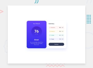
Hello, Thank you for checking my solution. I tried my best to make it as close to the original as possible. The padding and margins are looking good? Hope my code doesn't give you a headache! :<
Community feedback
- @danielmrz-devPosted 11 months ago
Hello @Alfrazgit!
You did a very good job there!
I have just a couple of very simple suggestions for improvement:
- Since the button is a clickable element, it's nice to add
cursor: pointerto it. - Also, there's not enough contrast between the color of the text and the background on the button, it's difficult to read it, even when clicked. Change it's color to a lighter one. This improves the accessibility of your project.
I hope it helps!
Other than those details, you did a great job!
Marked as helpful1@AlfrazgitPosted 11 months ago@danielmrz-dev Oh yes, I completely forgot about the cursor :( After publishing I felt that the button's text and background contrast was a little off. Thanks for confirming my suspicions.
Thanks.
1 - Since the button is a clickable element, it's nice to add
Please log in to post a comment
Log in with GitHubJoin our Discord community
Join thousands of Frontend Mentor community members taking the challenges, sharing resources, helping each other, and chatting about all things front-end!
Join our Discord
