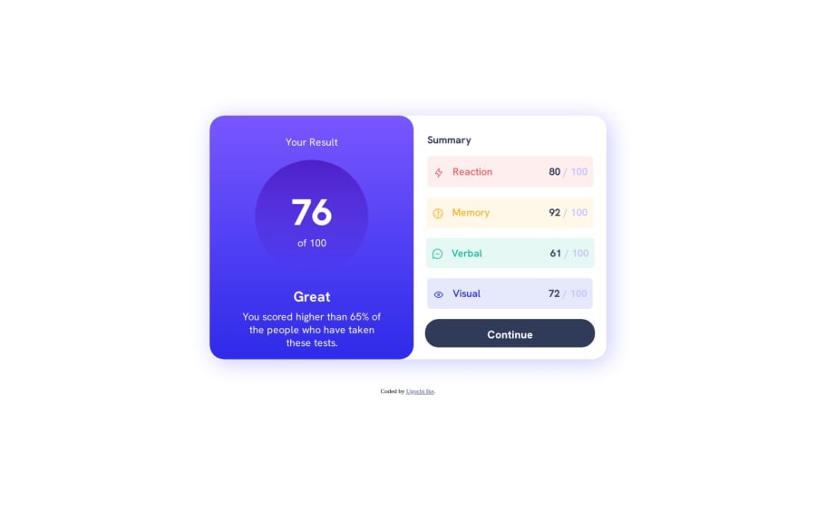
Design comparison
Solution retrospective
It took me so long to solve this. Does anyone here have an idea on semantic html?I tried to use it but quickly discarded it. I feel like i just used a bunch of padding and margins to do this to be honest. If anyone has a better solution please feel free to comment
Community feedback
- @matheuzebaPosted over 1 year ago
Semantic html is more about understanding what the meaning of the semantic tags are, and using your reasoning to choose what tags to use.
This site has a general idea to html
This one is pretty good for semantics and i recomend you to read it
Hope this helps you, I really liked your solution and Im going to start this challenge today!!
Wish me luck :D
Marked as helpful0@noneofurbuzzPosted over 1 year ago@matheuzeba Goodluck! and the websites were really helpful
1 - @0xabdulkhaliqPosted over 1 year ago
Hello there 👋. Congratulations on successfully completing the challenge! 🎉
- I have other recommendations regarding your code that I believe will be of great interest to you.
CSS 🎨:
- Looks like the
<footer">element has been placed bottom usingmargin. So let me explain, How you can place the component at bottom with usingfixedpositioning forfooter
- Luckily you already used
Flexlayout ofcssto center the component, So you just want to addfixedposition for<footer>element to place it in bottom of the page
.attribution {
   position: fixed;
   bottom: 1em;
}
- Now remove these styles, after removing you can able to see the changes
.attribution {
  padding-top: 50px;
}
- Now your component has been properly at bottom
.
I hope you find this helpful 😄 Above all, the solution you submitted is great !
Happy coding!
Marked as helpful0
Please log in to post a comment
Log in with GitHubJoin our Discord community
Join thousands of Frontend Mentor community members taking the challenges, sharing resources, helping each other, and chatting about all things front-end!
Join our Discord
