Submitted about 1 year ago
Responsive result with flexbox and position and mediaquery

@omarmohames

Design comparison
SolutionDesign

Solution retrospective
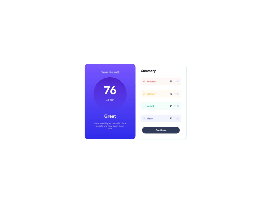
what is the best way to make the layout more responsive or its already good ?
Community feedback
- @zoedarkweatherPosted about 1 year ago
It is stretching a bit at the 450-800px range - I'd either set the media query for a smaller width or add another media query to handle that break point. Also, I'd work on trying to be a bit more descriptive with your class names as it makes your code a bit difficult to follow. Classes named one, two, or a, b, c, d maybe made sense in the moment, but it has no meaning for someone else trying to read your code or maybe even you if you come back to it a few weeks from now. Hope this is helpful.
0

Please log in to post a comment
Log in with GitHub
Join our Discord community
Join thousands of Frontend Mentor community members taking the challenges, sharing resources, helping each other, and chatting about all things front-end!
Join our Discord