

Design comparison

Solution retrospective
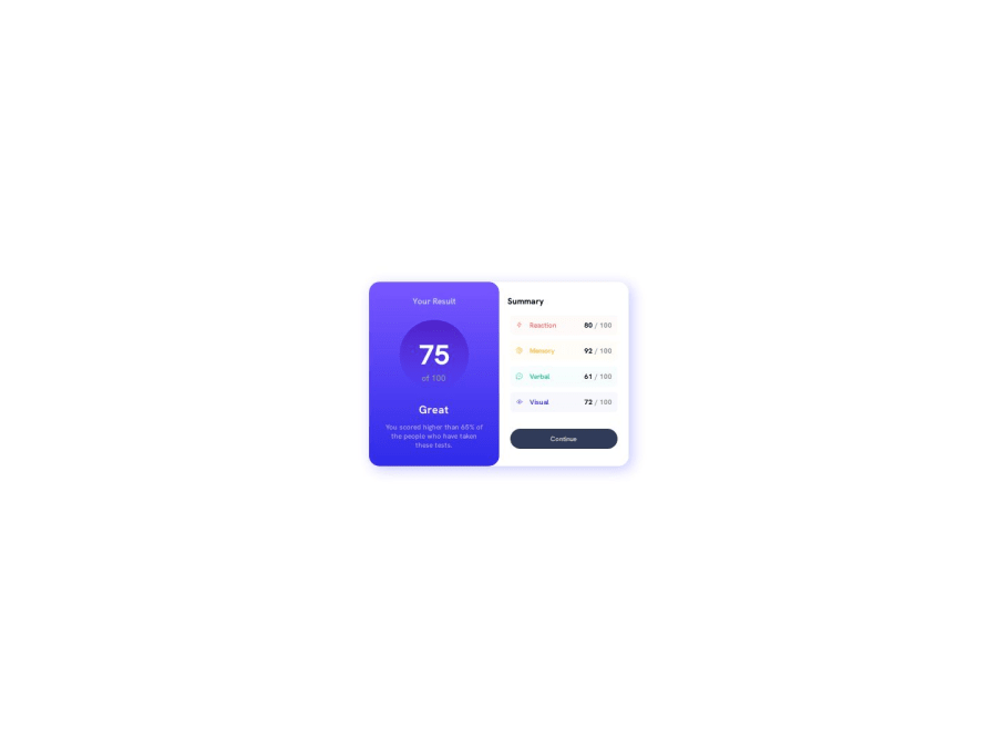
I feel like I used way too many code and time I will appreciate any feedback responsiveness and pixel perfect design.
Community feedback
- @MelvinAguilarPosted over 1 year ago
Hello there 👋. Good job on completing the challenge !
I have some suggestions about your code that might interest you.
- The fonts are too small; it's rarely a good idea to have fonts below 16px or 1rem. It makes reading the text difficult.
- It's not necessary to have a paragraph inside the link; the text can be directly inside the link.
- If you want your solution to look similar, you can use a browser extension called "Pixel Perfect" to try to make your solution resemble the design a bit more.
- Avoid using
<span>for entire blocks of text, <span> is an inline HTML element used to apply styles to specific parts of text without changing the structure or meaning, but this tag doesn't provide the same semantic value as other tags like paragraphs.
I hope you find it useful! 😄
Happy coding!
1@Ah-med007Posted 12 months agoThanks very much, will put that in mind going forward @MelvinAguilar
0 - P@danielmrz-devPosted over 1 year ago
Hello @Ah-med007!
Your solution looks great!
I have a couple of suggestions for improvement:
- For semantic reasons, use HTML headings for titles instead of
<p>. This tag is good for paragraphs.
The
<h1>to<h6>tags are used to define HTML headings.<h1>defines the most important heading.<h6>defines the least important heading. Only use one<h1>per page - this should represent the main heading/subject for the whole page. Also, do not skip heading levels - start with<h1>, then use<h2>, and so on.- Also, try increasing the size (proportionally) of your desktop version. It looks small and it's difficult to read it's content, unless you zoom it. You can start by increasing it's
max-width, then thefont-sizesand so on.
I hope it helps!
Other than those details, you did an excellent job!
0 - For semantic reasons, use HTML headings for titles instead of


Please log in to post a comment
Log in with GitHubJoin our Discord community
Join thousands of Frontend Mentor community members taking the challenges, sharing resources, helping each other, and chatting about all things front-end!
Join our Discord