Design comparison
Solution retrospective
All feedbacks are welcome
Community feedback
- @doganfurkanPosted over 1 year ago
Hey, good job! My suggestions would be:
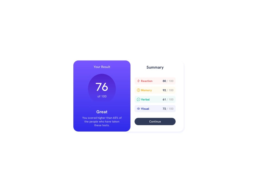
- Use aspect-ratio for a perfect round shape
- Try to avoid fixed widths and heights as much as you can. Especially for mobile, where the screen is already limited.
- Use em and rem units instead of px
- Your flex-item-1 classed div has a negative margin-bottom for what? Remove those margins and use "gap" for better control over margins.
I think if you handle those, you're going to end up with an excellent job.
Marked as helpful1@adetona54Posted over 1 year ago@doganfurkan Thanks for the advice, I will try to work on it
1 - @MoroccoBSPosted over 1 year ago
Maybe you can make the circle a little better, giving different random values to the padding is not the right approach, try giving a fixed width and aspect ratio of 1. But overall good work, Well done!
1@adetona54Posted over 1 year ago@MoroccoBS Thank you, I will try and work on it
0
Please log in to post a comment
Log in with GitHubJoin our Discord community
Join thousands of Frontend Mentor community members taking the challenges, sharing resources, helping each other, and chatting about all things front-end!
Join our Discord
