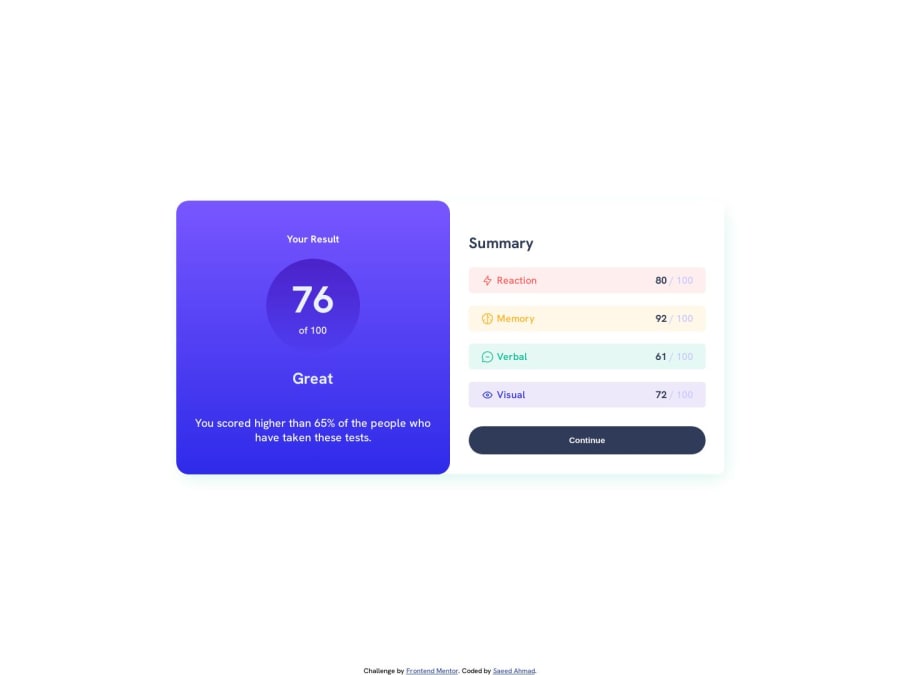
Design comparison
Community feedback
- @rohitd99Posted over 1 year ago
Hi Saeed Ahmed
Congrats on completing the challenge 🥳.
I see that you've used your headings in an incorrect way. Generally headings are used from
h1throughh6and each page must only have a singleh1for the title. So I would suggest you theh1for the "Your Result", andh2for the "Great" and "Summary". Secondly you've used theheight: 100vhon your body and the main in media query, I would suggest usingmin-height : 100vhso that the minimum height is 100vh and it can expand further as per content.Hope it helps.
1@saeedahmedasadPosted over 1 year ago@rohitd99 Thanks for your feedback. Will try to overcome these mistakes in future
0
Please log in to post a comment
Log in with GitHubJoin our Discord community
Join thousands of Frontend Mentor community members taking the challenges, sharing resources, helping each other, and chatting about all things front-end!
Join our Discord
