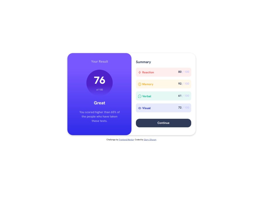
Design comparison
Solution retrospective
I am proud of being able to complete this challenge.
What challenges did you encounter, and how did you overcome them?-
I had issues with making the icons and text lay side by side but could use
transform: translateY()to balance the icons and text. -
I also had issues with making the button expand to the width of the container and I solved this issue by using
width: 100%
Any feedback would be welcome. Thanks
Community feedback
- @kaamiikPosted about 1 month ago
Hi congrats for doing this challenge. I have some notes that I wanna mention:
-
For your summary-items here is a good situation to use
ulwithli. Using semantic tags always better. -
Decorative images should not have an alt text.
-
After your
main, use a footer instead of div for the .attribution part. -
Your button should be an
atag because It takes you to a new page.
Marked as helpful1 -
Please log in to post a comment
Log in with GitHubJoin our Discord community
Join thousands of Frontend Mentor community members taking the challenges, sharing resources, helping each other, and chatting about all things front-end!
Join our Discord
