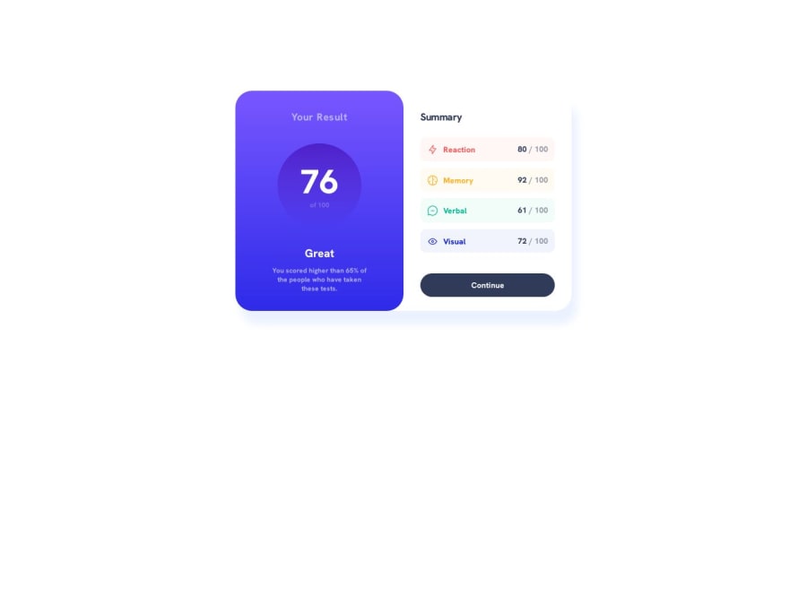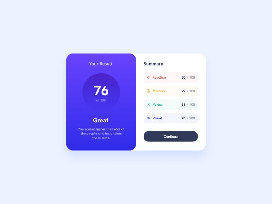
Responsive Result Summary Component (Html, Css)
Design comparison
Solution retrospective
If you have any questions regarding my answer I will do my best to give a proper response.
Feedback on my code:
- I started using the BEM naming system for classes. I wanted to know if I made any mistakes.
- Did I use the right Headings for my HTML or are some of the headings subjective?
Community feedback
- @mukwende2000Posted almost 2 years ago
Make sure you link the right repo, but i have seen the right one, one thing you should do firstly is to wrap the entire app in a main tag, this is the tag that tells that this is the main content of the page, as for the headings, try to think of them as headings in the real world, heading are just titles that summarise the content of a certain section, so the text "You result" is definitely a heading, but the number 76 is not, so correct it. Every page should have a h1 heading level element, you don't just start with h4, it has to follow the hieriachy, when ever you see anything that can be a heading, you must look above and check if there is already one, if so what level is it, if the last was an h1 then the next should be h2, if it was h2 then the next should be either h2 or below, you don't randomly put them. One thing that might confuse you is the font size, always know that the structure of html has nothing to do with styling, so you can have an h1 and give it a small font size just like in this challenge.
Marked as helpful0 - @mukwende2000Posted almost 2 years ago
You have linked the wrong github repo, its linking to the qr code component
1
Please log in to post a comment
Log in with GitHubJoin our Discord community
Join thousands of Frontend Mentor community members taking the challenges, sharing resources, helping each other, and chatting about all things front-end!
Join our Discord
