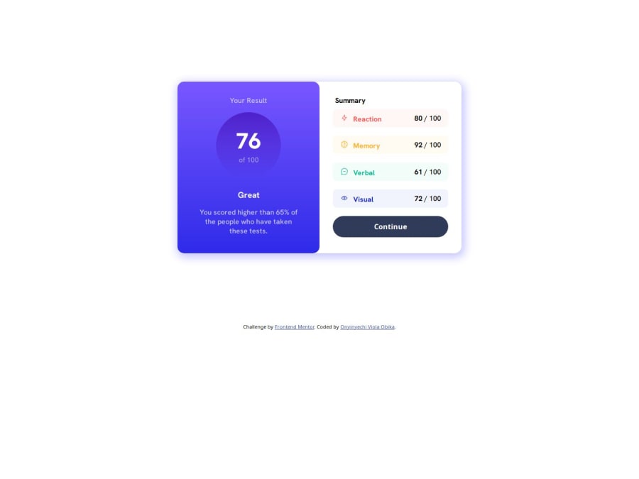
Design comparison
Solution retrospective
Just completed this challenge and I know it needs more work. Your suggestions will really be helpful.
Community feedback
- @muhammedakbPosted over 1 year ago
Hi there ππΌ First of all congratulations π
I like ur solution but i found a css bug. If you want fix it, you can remove in container class => grid-template-rows: 0.5fr 1fr;
Btw, you can search for css methodologies to write cleaner, readable, understandable and maintainable code.
Very good job! Have good day π
Marked as helpful1@ObikaviolaPosted over 1 year ago@muhammedakb Thanks for the bug fix. I really appreciate it.
0 - @0xabdulkhaliqPosted over 1 year ago
Hello there π. Congratulations on successfully completing the challenge! π
- I have other recommendations regarding your code that I believe will be of great interest to you.
BUTTON ELEMENT WITH CURSOR βοΈ:
- Looks like the component's
continue
element has usedp
for that but we want to usebutton
for that element.
- Then it doesn't has a pointer, this property plays a major-role in terms of both UI & UX
- The
cursor: pointer
CSS property is important for button-like elements because it changes the cursor from the default arrow to a pointer when hovering over the element. This provides a visual cue to the user that the element is clickable and encourages interaction.
- In terms of UI/UX, using
cursor: pointer
helps to improve the usability of the interface by making it easier for users to identify interactive elements. It also helps to provide feedback to the user by indicating which elements are clickable and which are not.
- So we want to add this property to the following
button
element
button { cursor: pointer; }
- Remember don't forget to change the
p
intobutton
to make this solution more accessible.
- Now your component's
button
has got the pointer & you learned about this property as well
.
I hope you find this helpful π Above all, the solution you submitted is great !
Happy coding!
Marked as helpful1@ObikaviolaPosted over 1 year ago@0xAbdulKhalid Thanks for the tips and corrections. the cursor property is really new to me but thanks to you, I now know about it and will make sure to use more from now on.
Also, changed the
p
tag tobutton
. I had tried it before submitting for this challenge but when it keeps showing outlines which I actually tried to remove but forgot how to and I had to usep
.It's been fixed now with the help of
border: 0px
Thanks for the corrections.
0 - @itushPosted over 1 year ago
Congratulations on completing the challenge! π
Your solution looks nice to me :)
-
It'd look even nicer if you apply top left and right cursive border-radius to the header for smaller screens.
-
To make it mobile responsive it is important to first understand how different breakpoints work with the media queries, which breakpoints to target etc.
In my projects:
- I always start with mobile-first workflow.
- I use at least one main element for a page (entire content goes into the main, if I'm not using header & footer), and avoid divs as much as possible and use section and article element wherever I can.
<body> <main> All content </main> </body>
-
I Use relative units as much as possible and avoid absolute units whenever possible.
-
If you are someone who is just starting out with front-end development, I strongly suggest starting with the QR code component project(which you did). Also in the challenges page you may filter by (Newbie, HTML&CSS) sort by (easier first) to select projects that will help you solidify your foundation. To avoid any potential knowledge gapβ οΈ please first solidify HTML, CSS, JS fundamentals and then move on to any framework or library.
-
I remember when I started out, I made countless mistakes and spent long hours searching for solutions. But hey, you don't need to go through the same struggles! π To help you shorten the learning curve, I recommend going through the following articles. They contain valuable insights that can make your journey smoother:
ππ 12 important CSS topics where I discuss about css position, z-index, box-model, flexbox, grid, media queries, mobile-first workflow, best practices etc. in a simple way.
ππ 11 important HTML topics where I discuss about my thought process and approach to convert a design/mock-up to HTML along with important topics like block and inline elements, HTML Semantic Elements.
I hope you find these resources helpful in your coding adventures! π€
I'm eagerly looking forward to seeing the amazing projects you'll create in the future! ππ»
Keep up the fantastic work and happy hacking! πͺβ¨
Marked as helpful1@ObikaviolaPosted over 1 year ago@itush Thanks for the help.
I would have applied the cursive border-radius for the mobile view but the design given by frontend mentor didn't have it. So I thought it best to do it according to their design.
For the mobile-first workflow, I'm still trying to wrap my head around it. I'm still having a hard time understanding
@ media queries
.I will try updating the absolute units to responsive ones as soon as I figure out how to actually convert them to the actual responsive unit.
This is my third challenge on frontend mentor though.
And thank you for the articles. They came at the right time.
0 -
Please log in to post a comment
Log in with GitHubJoin our Discord community
Join thousands of Frontend Mentor community members taking the challenges, sharing resources, helping each other, and chatting about all things front-end!
Join our Discord