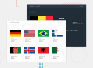
Responsive REST Countries API with color theme switcher with React
Design comparison
Solution retrospective
Hello community members,
I just finished the rest countries API with theme switcher challege. Please help review, any feedback is greatly appreciated ! :)
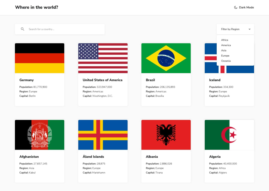
I struggled a bit to the card spacing and alignment as per the design, I noticed there is quite a bit of spacing between two cards. I used the map method to display the country data in the cards, I wasn't able to add space between the cards without adding it at the edges which caused the start and end margin cards to be misaligned with the search input and filter dropdown. The current layout I have looks similar but not same as that provided in the image. Was wondering if anyone had any feedback on how to achieve that spacing in-between cards without misaligning the start and end?
Also, I used the bootstraps v5 color modes to implement the theme toggler switcher but had to customize the default dark theme to match the style guide provided. Was wondering if that's the right approach or should I have defined a custom theme itself or any other better approach to implementing theme toggling?
Thanks, snhase
Community feedback
Please log in to post a comment
Log in with GitHubJoin our Discord community
Join thousands of Frontend Mentor community members taking the challenges, sharing resources, helping each other, and chatting about all things front-end!
Join our Discord
