Submitted about 3 years ago
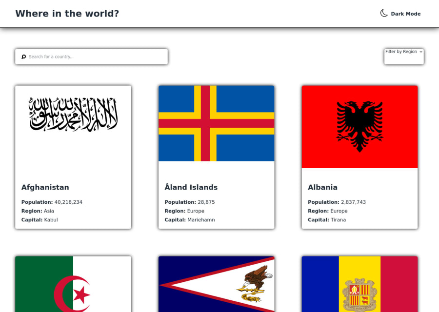
Responsive Rest Countries API App using React.
#react#react-router
@Ryan-D-P
Design comparison
SolutionDesign
Community feedback
- @KaiPereiraPosted about 3 years ago
Nice job Ryan,
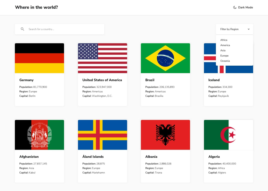
A couple small details are that you can make your box shadow look more clean by making it rgba(0, 0, 0, 0.3) the fourth option is the opacity just to make it less dark. I would suggest putting justify-content: space-around; on your .countries container to make each country go all the way to he edges of the container and still be responsive. Good job though and keep it up!
Marked as helpful1
Please log in to post a comment
Log in with GitHubJoin our Discord community
Join thousands of Frontend Mentor community members taking the challenges, sharing resources, helping each other, and chatting about all things front-end!
Join our Discord
