Design comparison
SolutionDesign
Solution retrospective
What are you most proud of, and what would you do differently next time?
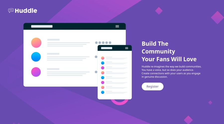
i was proud of how the website turned to look when i finished it.
What challenges did you encounter, and how did you overcome them?with the icons in the footer and making the button small for pc and large mobile. i fixed it with editing the width
What specific areas of your project would you like help with?when i make it responsive, the background image covers the button. i need help with that. also any feedback will be appreciated.
Community feedback
- @Endy1381Posted 12 months ago
guys i am struggling with the footer, it isn't showing up so i kindly request any help
0
Please log in to post a comment
Log in with GitHubJoin our Discord community
Join thousands of Frontend Mentor community members taking the challenges, sharing resources, helping each other, and chatting about all things front-end!
Join our Discord
