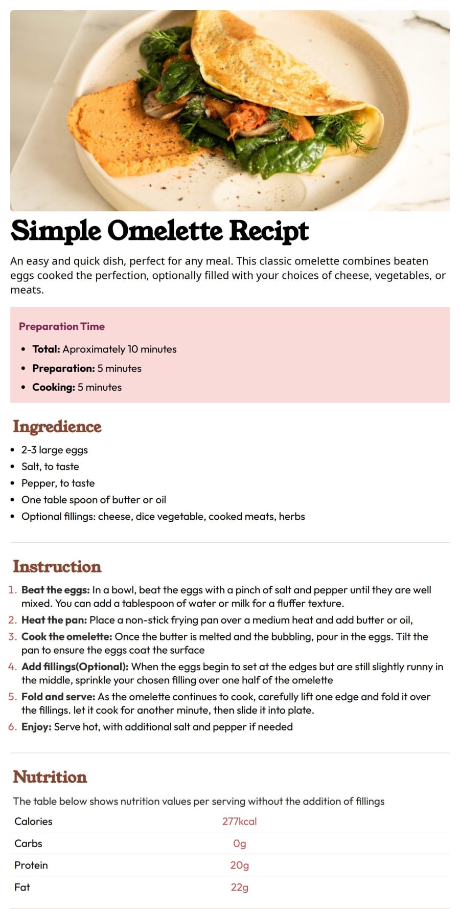


Design comparison
SolutionDesign

Community feedback
- P@OdiestaPosted 3 months ago
Hi Gyizmark, Congratulation by completing the challenge. I noticed that the content looks too big in big screen. i want to give way to fix it.
- Set the image width to 100% and display block to make it adjust 100% to parent size container.
- If you are using
rem, set the font size inhtmlselector to 62.5%. this will make sure 1 rem equal to 10px making it easier to calculate.
- set body display to flex, align-items: center, justify-content: center to make the children of body which is the
maintag container centered in the body
- set the main style to at least 70rem. this will make sure the content not stretch too wide in desktop screen while it responsive in mobile screen.
- Do not use clamp in font-size as it will make the font size look too big in desktop version. instead use media query to set different font-size
Marked as helpful0

Please log in to post a comment
Log in with GitHub
Join our Discord community
Join thousands of Frontend Mentor community members taking the challenges, sharing resources, helping each other, and chatting about all things front-end!
Join our Discord