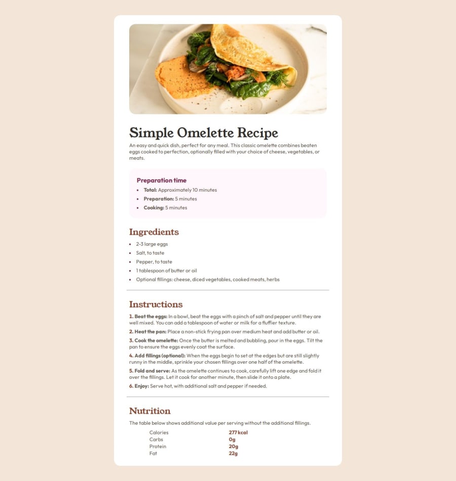
Design comparison
Solution retrospective
I worked first on the mobile design.
What challenges did you encounter, and how did you overcome them?I still do not know how to add or borders below table rows.
What specific areas of your project would you like help with?How to add borders/hr elements to table rows?
Community feedback
- @FirstHalcyonPosted 5 months ago
Hey, Aurélien, good job on this project! It took me a while to complete too.
Mobile looks pretty good. I'd suggest adding some extra padding between the elements to get closer to the original design (or more of a gap since you're using Flex). Try playing around with some rems to tinker with it further.
As for your question, I added a bottom border under the td elements, and erased only the one under the last row. You could also do the same thing under the tr element and it would have the same effect. To eliminate the gaps between td elements, I used border-collapse: collapse; for the entire table. It worked for me and it looked like the design.
This answer from stackoverflow is pretty good and I can confirm that it works fine: https://stackoverflow.com/questions/13624276/how-to-separate-table-rows-with-a-line
Great job with the semantics too. Keep it up!
0
Please log in to post a comment
Log in with GitHubJoin our Discord community
Join thousands of Frontend Mentor community members taking the challenges, sharing resources, helping each other, and chatting about all things front-end!
Join our Discord
