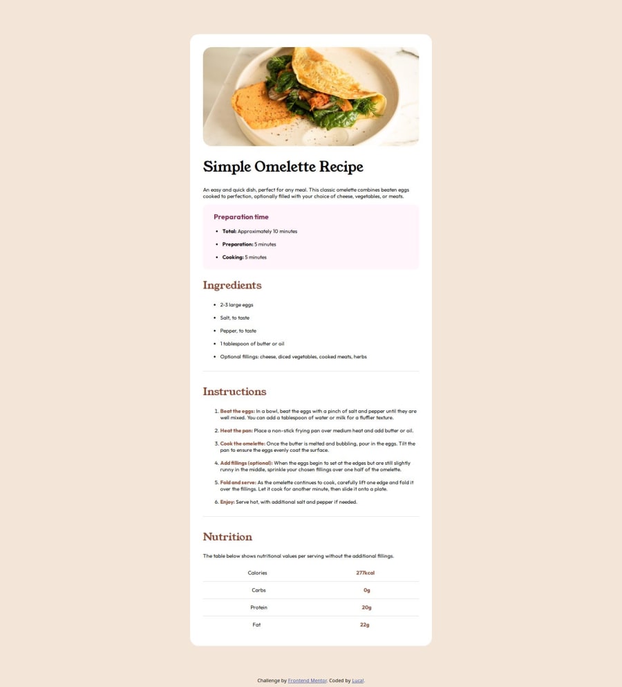
Responsive recipes web created with Html and SASS
Design comparison
Solution retrospective
I am proud of me becasue I think this challenge was easy and the next time I will start with mobile-first
What challenges did you encounter, and how did you overcome them?I had some problems with change the color of the list, I dont know how to do that but I will learn in another challenge!
Community feedback
- @mbtenkorangPosted about 1 year ago
Hello 🙋♂️ @LucaRiver0n,
Congratulations on completing this challenge. 👏🎊🥳🎉
- About styling dots and numbers in front of the list, you'll have to use the
::marker{}tag to target these elements. You may use the following resources to learn more about it - 1️⃣CSS Tricks
- 2️⃣MDN
I hope this tip helps improve your solution.
All the best and happy coding 😀🧑💻🌟
0 - About styling dots and numbers in front of the list, you'll have to use the
- @DanCodeCraftPosted about 1 year ago
Good job overall, @LucaRiver0n!
To change the color of the list, is this simple:
li::marker {
  color: your_color_of_choice; -> change the color
  font-size: x.xrem; -> change the size of the marker
}
I would recommend you pay a bit more attention to the size of fonts, and spacing in general. It will give your pages a whole different look and improvement.
As well, you should consider using different measuring units, other than px. They do have a purpose and help with accessibility.
Keep up the good work!
0
Please log in to post a comment
Log in with GitHubJoin our Discord community
Join thousands of Frontend Mentor community members taking the challenges, sharing resources, helping each other, and chatting about all things front-end!
Join our Discord
