Responsive Recipes using Tailwind and Next
Design comparison
Solution retrospective
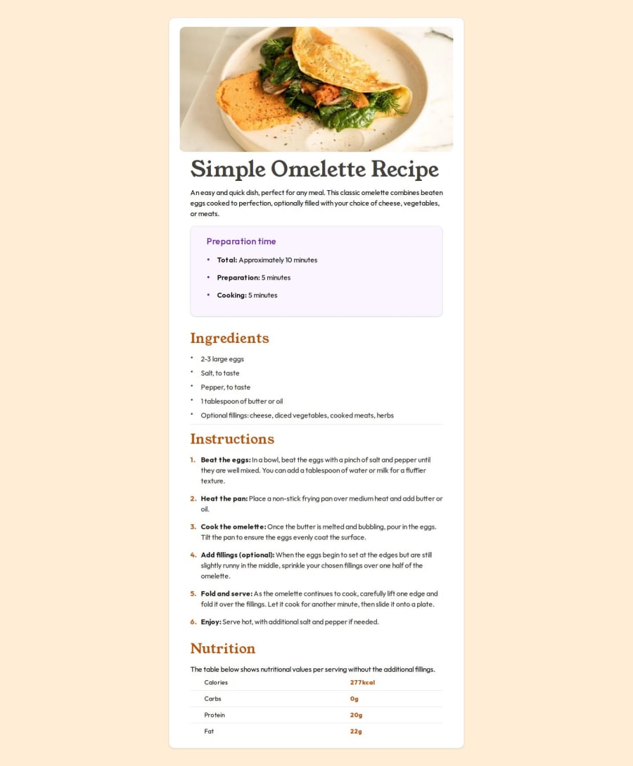
I started this a few weeks ago, and circled back to a few other exercises. I'm really happy how this came together and how I was able to rework the responsiveness after learning more about Tailwind.
What challenges did you encounter, and how did you overcome them?I was a bit frustrated that to use the Tailwind card, I had to replicate the contents, so I did a little refactor of the components, to use a wrapper that was displayed larger sizes, but at smaller sizes only show the inner content, and not the wrapper, with block sm:hidden / sm:block hidden
Nothing at this point.
Join our Discord community
Join thousands of Frontend Mentor community members taking the challenges, sharing resources, helping each other, and chatting about all things front-end!
Join our Discord
