

Design comparison

Solution retrospective
While I ended up changing how I was going to style certain elements partway through, I was able to learn a good bit about additional topics like styling the counters on the ol and li elements, and border-collapse on tables.
The two trickiest parts for this were probably the table and the counter styling for the ol element.
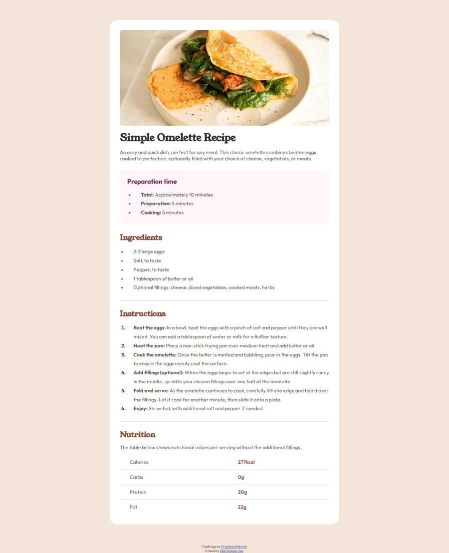
- For the table, I was uncertain how best to approach a vertical layout and considered using flexbox or grid instead, though ended up with a much simpler implementation of a regular
tableelement that I feel is cleaner and works better semantically. - The
olstyling ended up with me in a rabbit hole which brought me to thecounter-restandcounter-incrementproperties, which I do think will be very useful to utilize in the future. But then after an entire complex look into that and other potentially redundant styling methods, I looked at the the dev tools one last time and saw::markerexists. That makes things a lot easier.
Are there any alternative approaches I probably could have used for any parts of this, especially with the ol styling? At this point I'm not too sure if the methods I used are redundant or if they work well, but any pointers are always appreciated!
Community feedback
- @TedJenklerPosted 7 months ago
Hi @starberries,
Nice project! Here are a couple of suggestions for improvement:
ARIA Labels: To enhance accessibility, always add aria-label attributes to div elements when semantic HTML isn’t used. This will greatly improve accessibility and assist screen readers.
Overflow Issues: I noticed that your content is overflowing on the left and right. Try using overflow-x-hidden on a parent element and remove any margins from the body or html that might be causing the issue.
Hope these tips help!
Best, Teodor
Marked as helpful1 - P@edpauPosted 7 months ago
Nice code, I went to a similar direction as yours on the ol and li element. I was trying to match the Figma design. I read this and found it interesting. https://css-tricks.com/everything-you-need-to-know-about-the-gap-after-the-list-marker/
I experimented on my solution, it ended up over complicated the code and affect the accessibility. But I learned a lot from it. I will keep it simple next time.
Grace-Snow guided me a lot in discord, below is the link if you are interested. I am working on refactoring my code. https://discord.com/channels/824970620529279006/1277755314283876384
Marked as helpful1@starberriesPosted 7 months ago@edpau Thanks a lot for the info, I had seen a bit one using images and the like for markers while doing some research on the subject and was curious about looking more into that at a later point, so I'll definitely take a look through both of those. Appreciated!
1


Please log in to post a comment
Log in with GitHubJoin our Discord community
Join thousands of Frontend Mentor community members taking the challenges, sharing resources, helping each other, and chatting about all things front-end!
Join our Discord