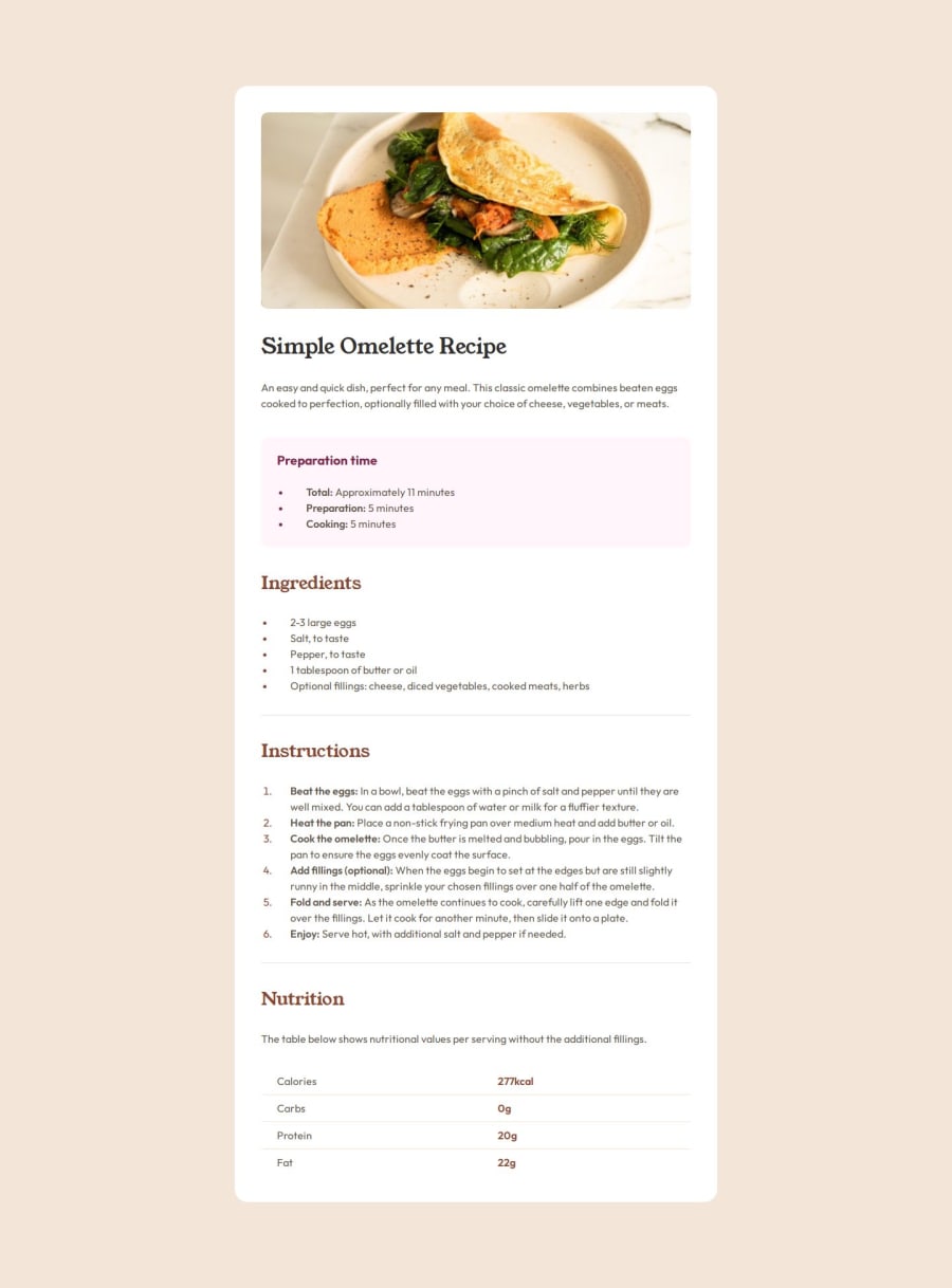


Design comparison

Solution retrospective
I make it responsive and looks nice (at least I think). I'll make it quciker next time.
What challenges did you encounter, and how did you overcome them?This is the most difficult time I have ever written code, although I am quite satisfied with the actual effect.
I noticed that on small screen sizes, the recipe__img spans the full width, but others not. I am hesitant about how to handle it. Finally I use a container wrapper the text content then give it padding-inline.(Now I think recipe__main-container is a better name. container give it some ambiguity led me having some wrong thoughts)
Then when screen size is big enough, I make the whole recipe card flex and have it centered. For recipe__img I give it the same padding-inline of container
I think this solution is a bit funny, must be a better way, but I can't think of it. I learned from Kevin that I can use a grid layout to make a call-to-action img, but I had a trouble because I don't know enough about the grid layout, and I doubt whether it is the best solution here(too complex), so I ended up using this funny but simpler method. Hopefully I can find a better way by other coders after submitting this assignment
.container {
  padding: 0 var(--space32) var(--space32);
}

@media screen and (min-width: 500px) {
  .main {
    display: flex;
    justify-content: center;
    align-items: center;
    background-color: var(--clr-stone100);
  }

  .recipe {
    max-width: 730px;
    margin-block: 8.125rem;
    border-radius: 20px;
    overflow: hidden;
    padding-top: var(--space40);
  }

  .recipe__img {
    /* border-radius is calculated based on the original value with padding added */
    padding-inline: var(--space40);
    overflow: hidden;
  }

  .recipe__img img {
    border-radius: 10px;
  }

  .container {
    padding: 0 var(--space40) var(--space40);
  }
}
- control list-style
can just use padding on ul(ol) to push content right. dot not content
and color on ul also nice. I use ::marker on li(not ul) to colored dot.
.recipe__list {
  margin-block: 0;
  color: var(--clr-stone600);
  padding-left: 20px;
}
.recipe__list-item::marker {
  color: var(--clr-brown800);
}
- same style (BEM)
I found that the styles of the titles were all the same, so I used a generic recipe__title and a slightly modified recipe__title--section/main for them. Also for list.
- create a table
table -> tr -> td. use border-bottom to create divider(and :not pseudo element). use :nth-child bold right column(maybe have better solution?)
more details on MDN docs
- border-radius on img
the conflict between padding-inline and border-radius. When adding padding-inline to .recipe__img, the internal element will reduce its width to adapt to the padding, but its rounded corners are still calculated based on its original size, resulting in the rounded corner effect seemingly disappearing.
I asked gpt it give me 2 solutions:
- give
recipe__img imga border-radius. So the parent have padding, but child not
  .recipe__img img {
  width: calc(100% -2 * var(--space32))
}
- use
calc()to control img width
.recipe__img img {
  width: calc(100% -2 * var(--space32))
}
I use solution 1.
What specific areas of your project would you like help with?the divider and the spacing between them were one of the hardest parts of the whole page. There are many ways to achieve it but it's impossible to know which is the best practice.
Finally I use recipe__title's margin and recipe__section's padding-bottom. section margin-top is zero.
Maybe a nicer solution?
Community feedback
- @NorimNoriPosted about 2 months ago
Hi @coyoteshkw !
-
Your solution is working well, one alternative to explore could be using max-width: 100% for images and combining it with media queries to adjust their size based on the viewport width. This may provide more flexibility and better results on a range of screen sizes. You could also experiment with object-fit for image scaling, depending on the design requirements.
-
The table styling is functional and well-organized, with borders and padding creating a clean structure. However, you noted that you weren't sure if the approach to bolding the right column was optimal. Consider using
:first-childor:last-childpseudo-classes if you want more flexibility in targeting specific columns. -
The border-radius issue with the image and its container is a great example of the challenges that come with padding and border-radius. Your solution of using width: calc(100% - 2 * var(--space32)) for the image is solid, as it addresses the padding conflict. Another option would be to set the border-radius on both the container and the image itself, ensuring both elements match in appearance. You could also explore using overflow: hidden on the parent container to make sure the rounded corners are applied to the image, even when it's resized.
You've done a fantastic job navigating through some complex CSS challenges, especially with responsive design and layout control. Your solutions, particularly with flexbox and padding, have provided a clean, functional result. As you continue to refine your project, experimenting with newer layout techniques like CSS Grid could bring even more flexibility and clarity to your code.
Marked as helpful0@coyoteshkwPosted about 2 months ago@NorimNori thanks for reply! "Another option would be to set the border-radius on both the container and the image itself, ensuring both elements match in appearance." helps me a lot.
1@NorimNoriPosted about 1 month agoHi @coyoteshkw !
Glad to hear that! Happy to help! c:
0 -

Please log in to post a comment
Log in with GitHub
Join our Discord community
Join thousands of Frontend Mentor community members taking the challenges, sharing resources, helping each other, and chatting about all things front-end!
Join our Discord