Design comparison
Community feedback
- P@KellenkjamesPosted 5 months ago
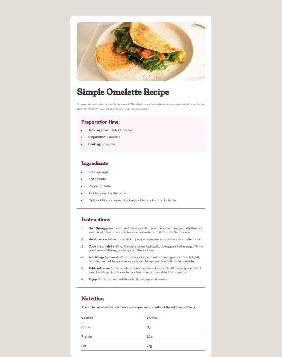
Overall, I think the semantic markup and organization of the code is great. However, I think a little bit more time can be spent on fixing a few areas to get the solution looking closer to the design.
One example would be your
maincontainer. I notice you're not setting amax-widthon this container which should be736pxaccording to the design.Because there is no
max-widthset, your image is much growing larger than it should since it's basing it's dimensions from the parent container.Example | Line 35 in _base.scss
main {
  display: flex;
  flex-direction: column;
  justify-content: flex-start;
  gap: 1.5rem;
  width: 50%;
  margin: 5rem auto;
  padding: 2rem;
  background-color: $white;
  @include border();
  max-width: 736px /* Adjust to REM value */
  ...
Making this adjustment and a few others will get your solution looking even more clean and professional. Hope this feedback helps and keep up the great work!
0
Please log in to post a comment
Log in with GitHubJoin our Discord community
Join thousands of Frontend Mentor community members taking the challenges, sharing resources, helping each other, and chatting about all things front-end!
Join our Discord
